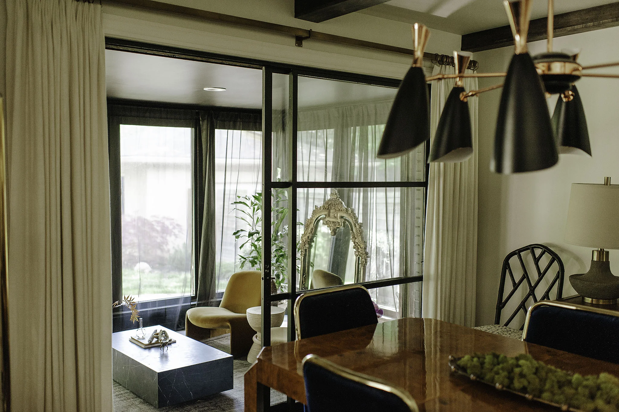
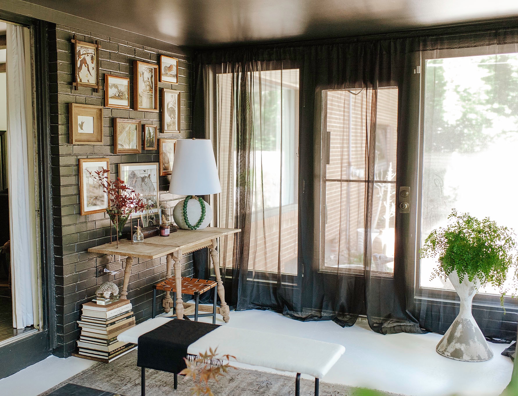
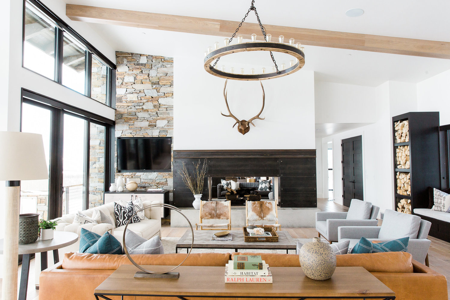
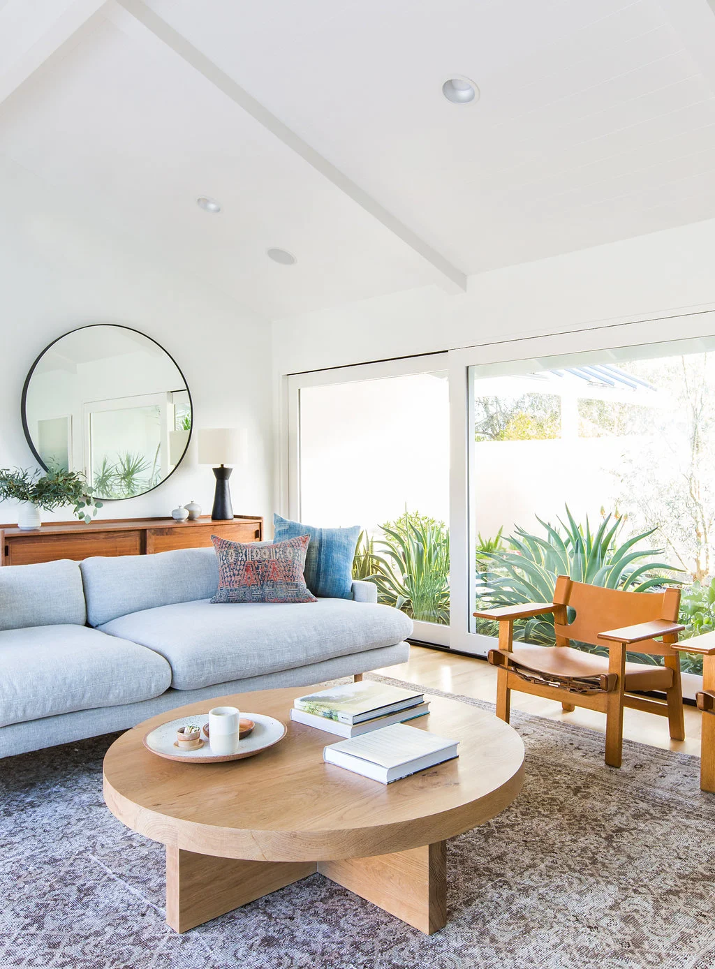
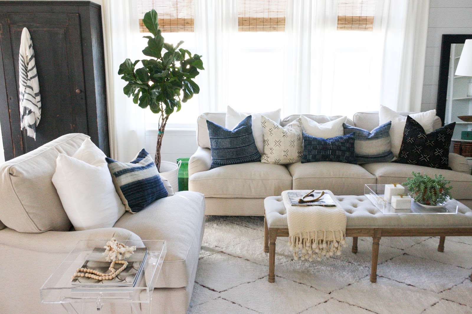
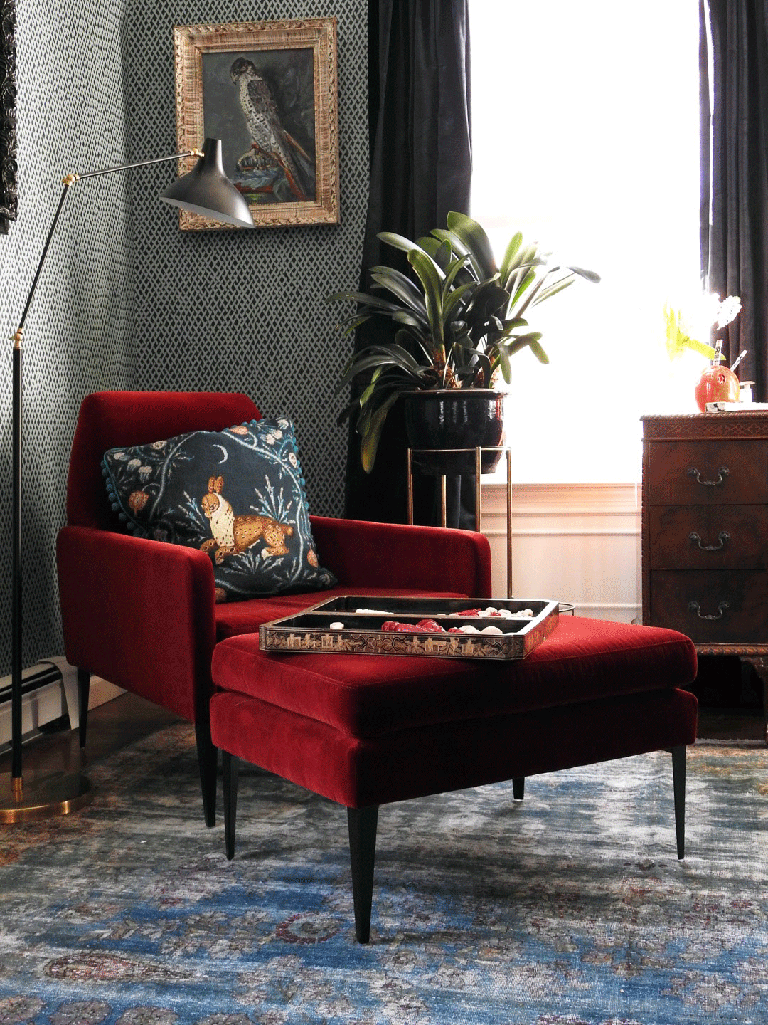
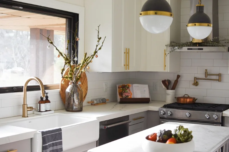
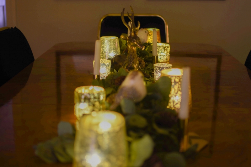
The Rule of 8-One Room Challenge Week Five

Hello! It’s week five of the One Room Challenge and I am so happy to say….I WILL FINISH!!!!!!!!! I seriously had my doubts I could pull this off while juggling a full time job with out of state travel, a design business, and the million personal things going on in our lives but I did….and I am proud of myself. Do you ever say that to yourself? I don’t too often, but we should!

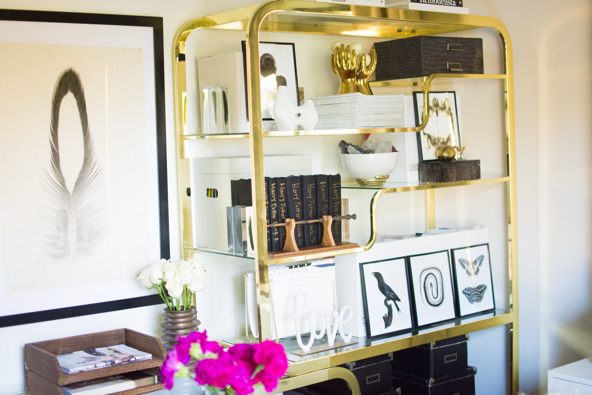
Last week I shared our reupholstery project and shared some tips for getting reupholstery done on one of your pieces. This week I am sharing my “Go-To Formula” for almost any space. It’s definitely a consistent theme in our home but I can completely respect that everyone has their own style and may hate some of these below touches. I have seen various versions of this type of design theory over the years and mine has continued to change as my knowledge and experience grow.

8things.png

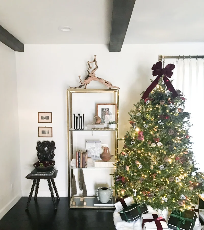
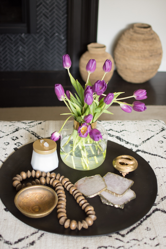
Wood-The natural warmth that wood introduced to a room cannot be replaced with anything (IMO). Whether maple, oak, pine, or walnut, each grain is unique and adds not only warmth but texture to a space. If you are lucky to score a vintage piece of wood furniture (or even decor), you are in for such a special treat with your finished space.

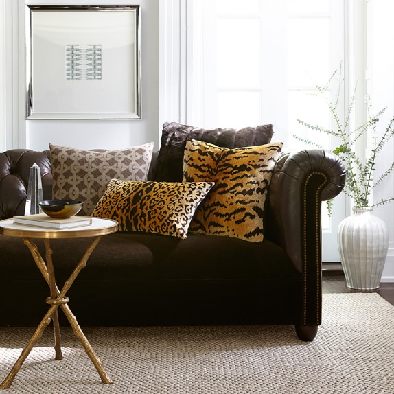
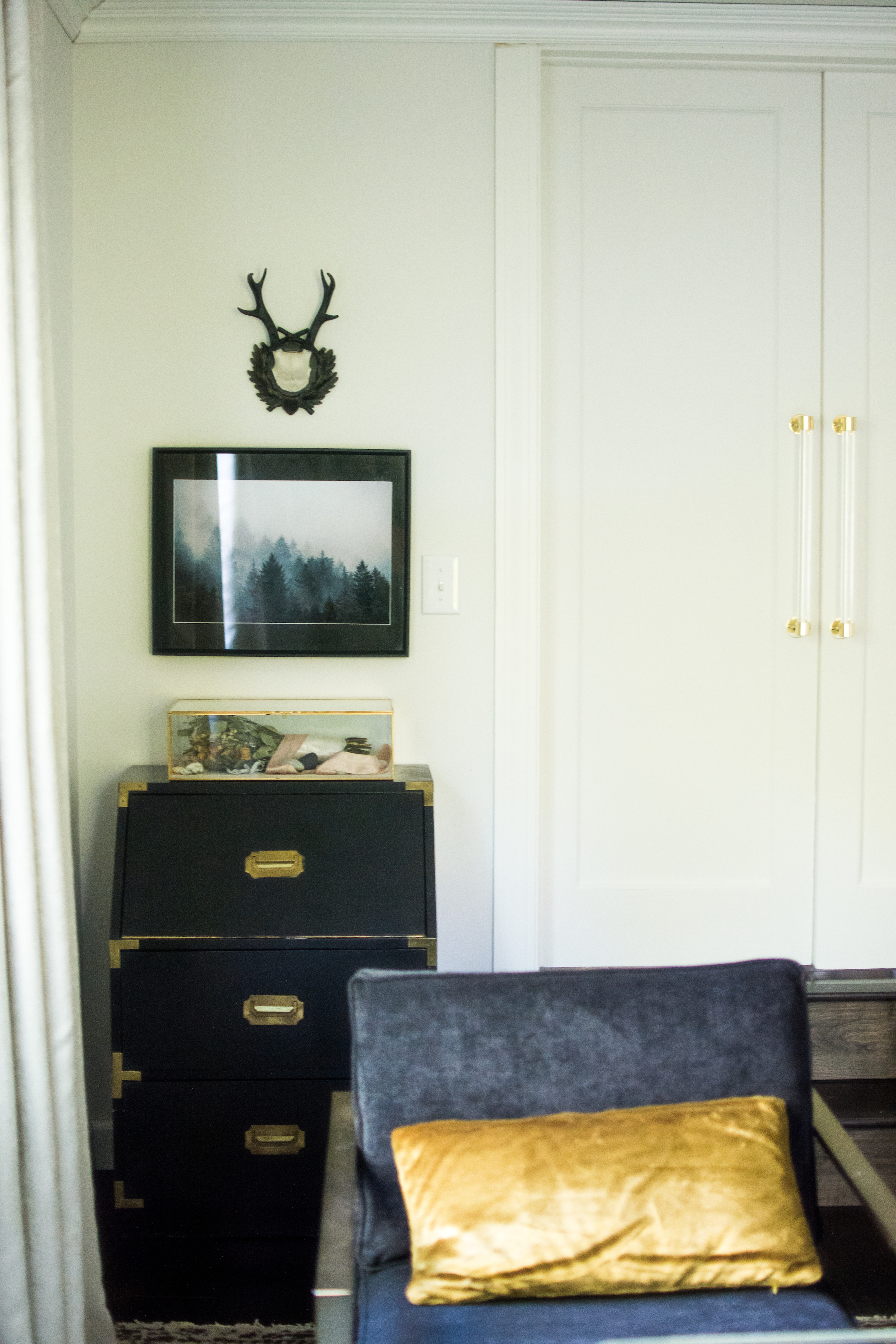
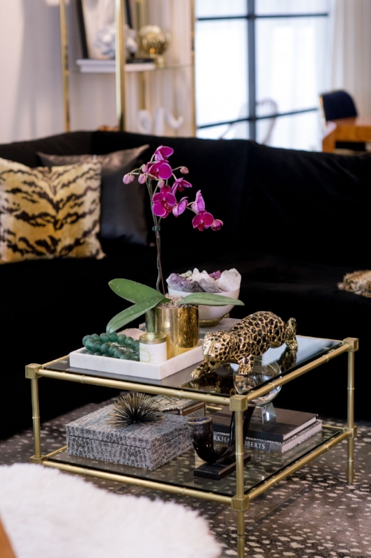
Animal-Now, this one can be controversial but is a very broad category. I am a firm believer that every room needs a touch of “animal”. This can be in the literal sense: Animal Art, Horns on a wall, animal prints, etc. or it can be something a bit more subtle such as an angora throw, layered sheepskin rug, or a framed feather. Manufacturers have perfected the faux animal so this can be a very accessible and affordable item to add to any room.

animal.jpg

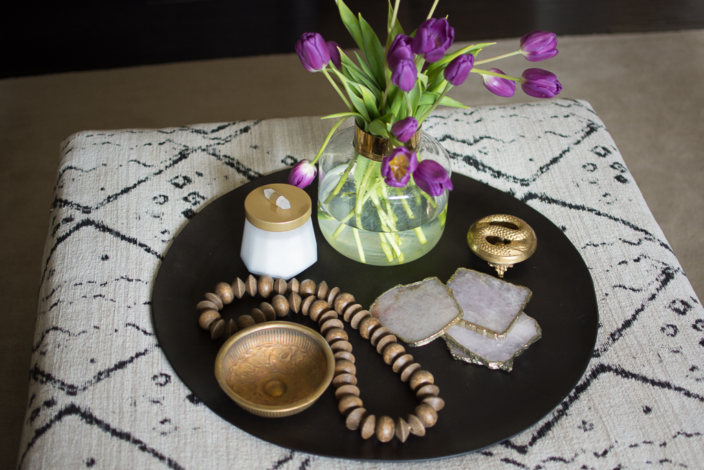
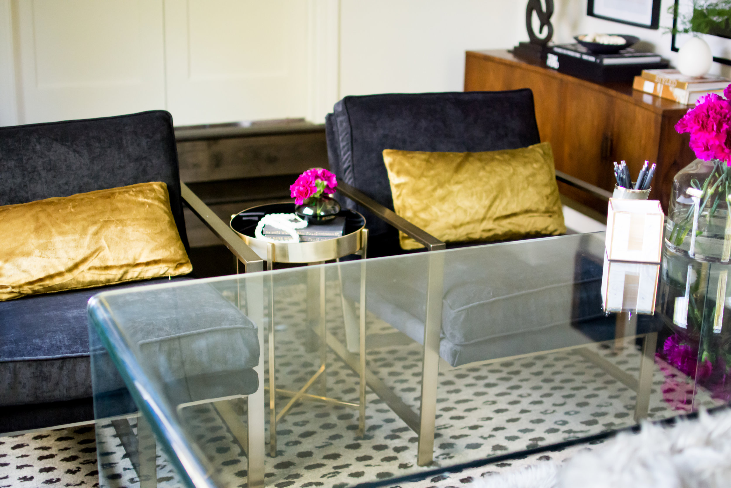
Texture/Pattern-By now you have probably learned that I do no( use much color in my spaces. Even with clients, I try and create a neutral foundation first and then layer in color, if requested. Texture/Patterns are my preferred way to add interesting touches to a room. A simple woven bench or stool….a chunky pillow….a pattern on a rug….there are so many ways to add texture to a room and help create a space that does not fall flat.

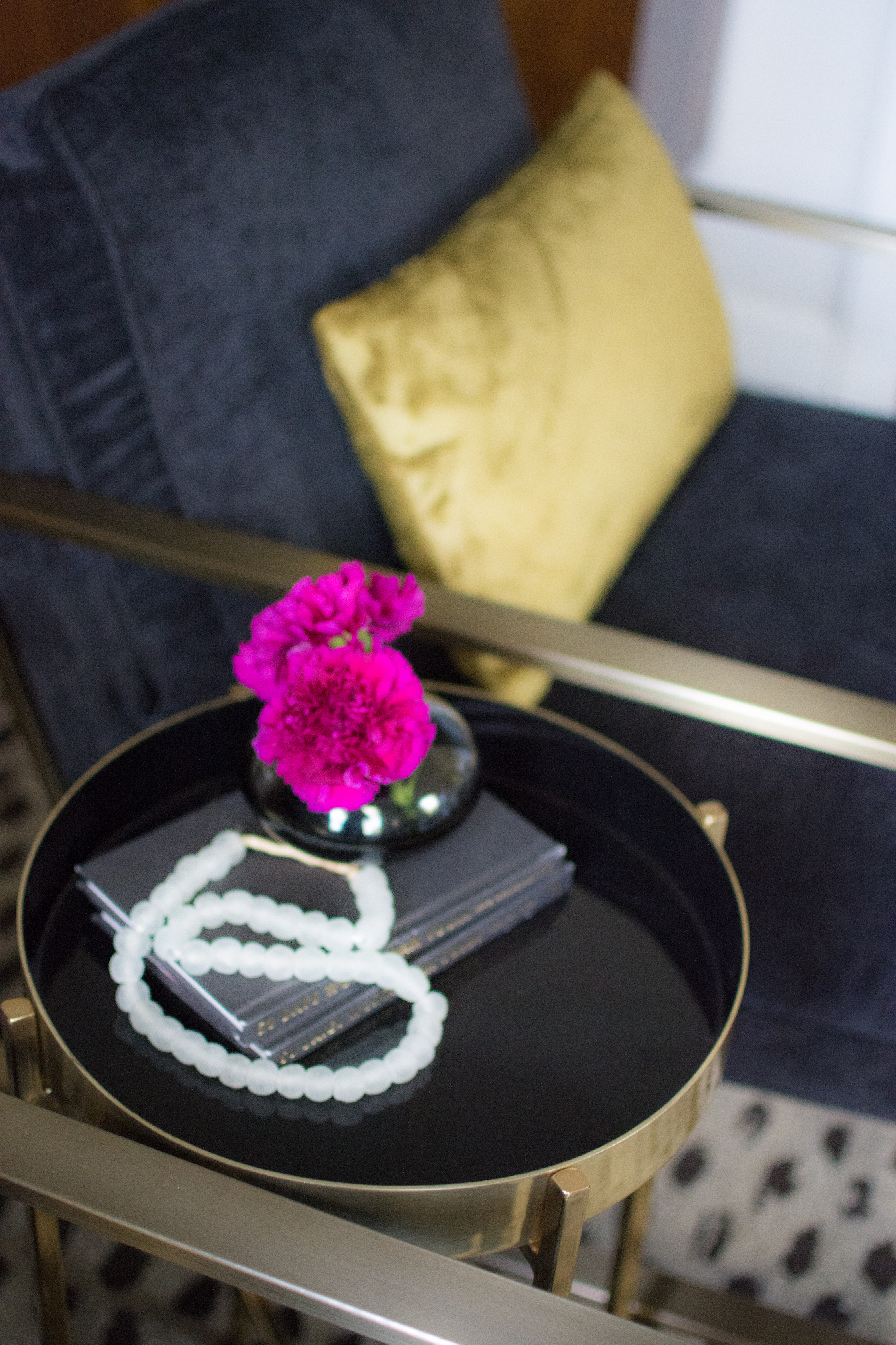
Black-Every room needs a touch of black. I stand firm with that believe. This does not need to be a black wall or black sofa like we have in our home and can be as subtle as a stack of black books or a black sculpture. Black is a timeless and bold color and just the tiniest bit of it can enhance a space.

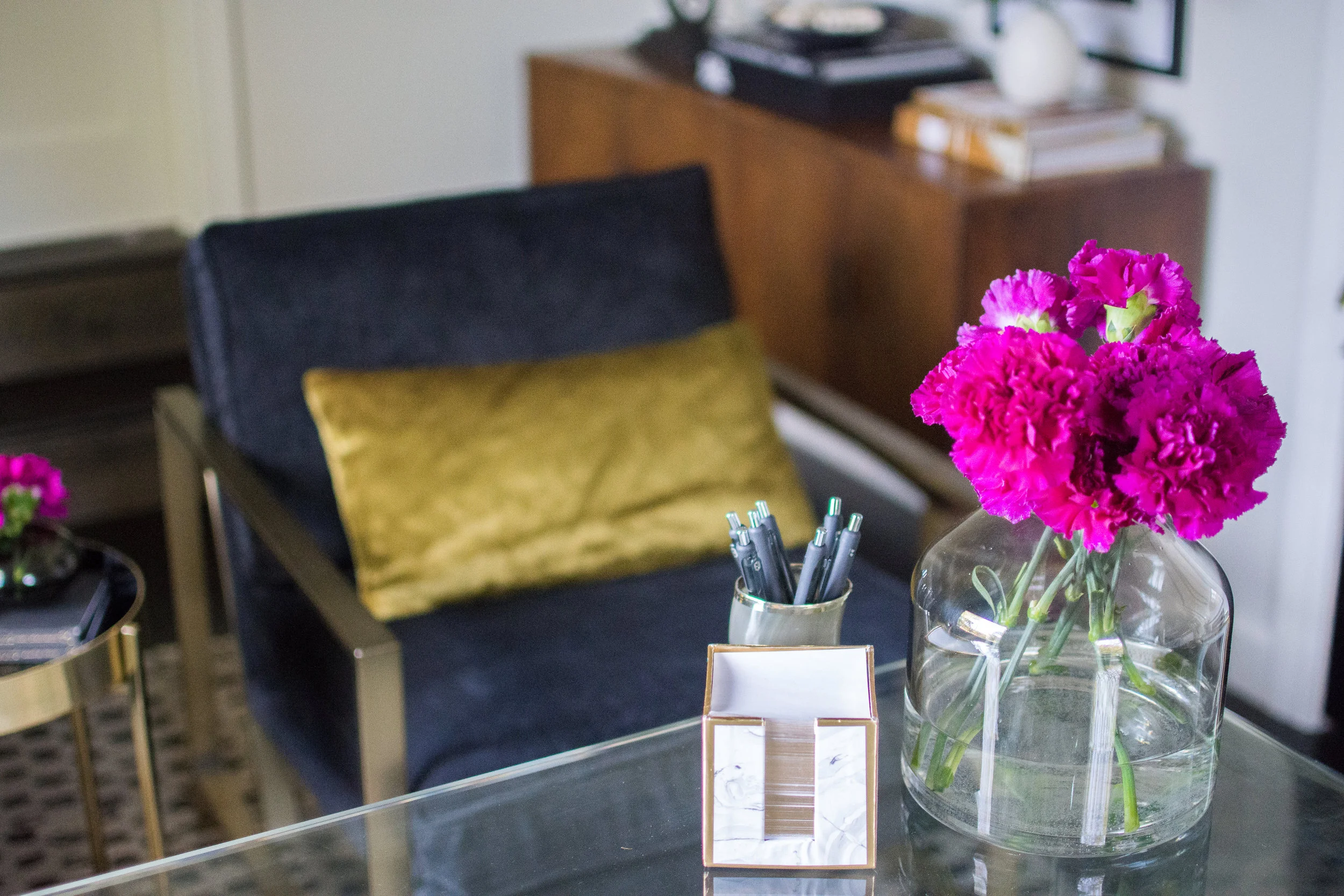
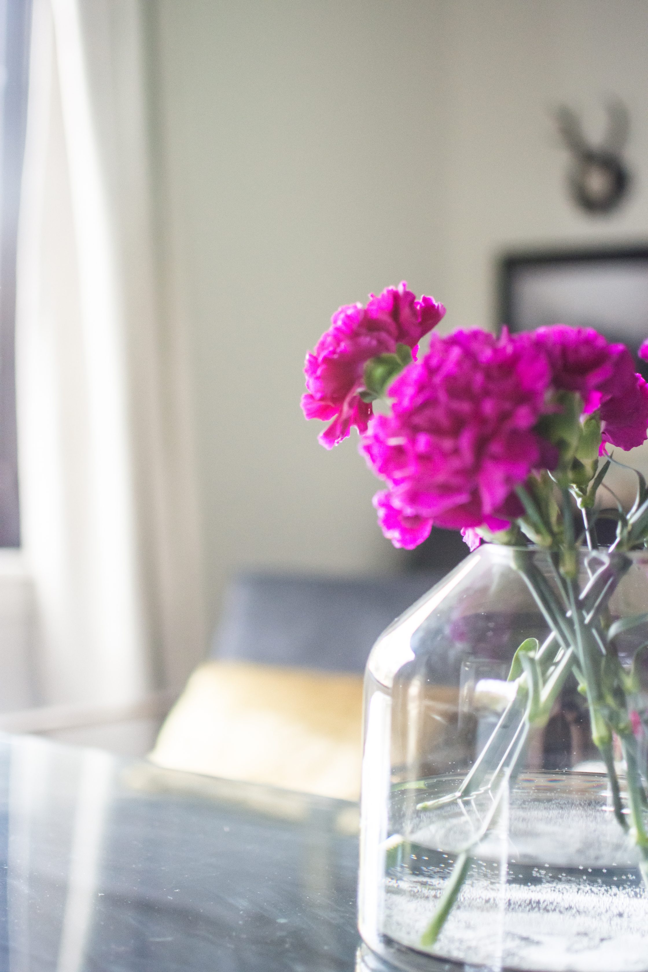
Nature (Plants or flowers)-Plants and flowers bring life into a space. While there is definitely a time for a good faux, I am an advocate for real plants and flowers. Trader Joes and your local grocery store should always have a nice assortment of fresh flowers to add to your room. Check out your local nurseries for houseplants and be sure to use the expertise of their staff if you have any questions on caring for your plants

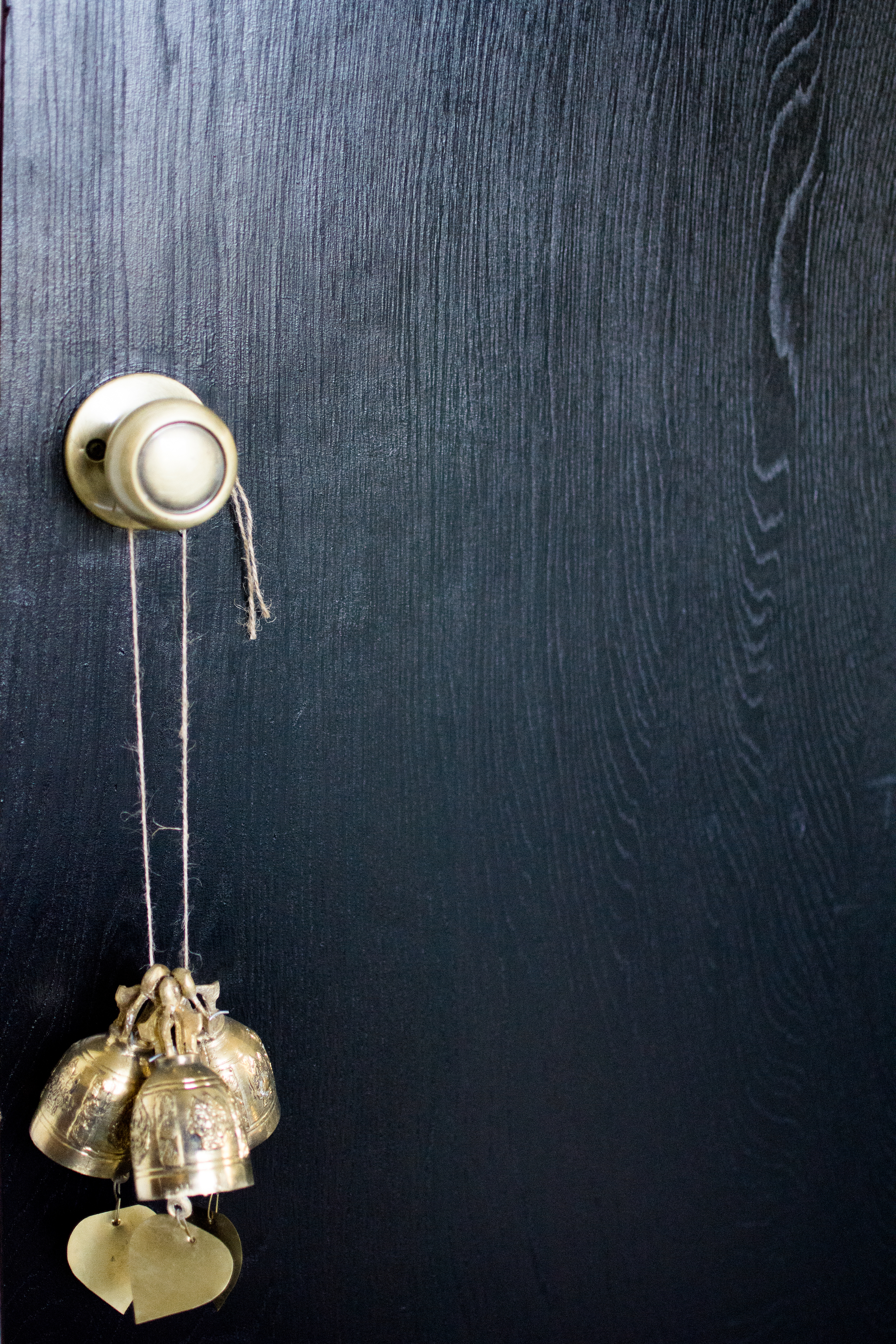
Brass (or your choice of metal)- While I am a fan of brass (brushed, antique, and even the gaudy!), I know it isn’t for anyone. Adding a metal element adds either shine or a nice masculine touch to any space. This can be in a mirror, legs of a table/chair, or a unique wall sculpture, there are so many options.

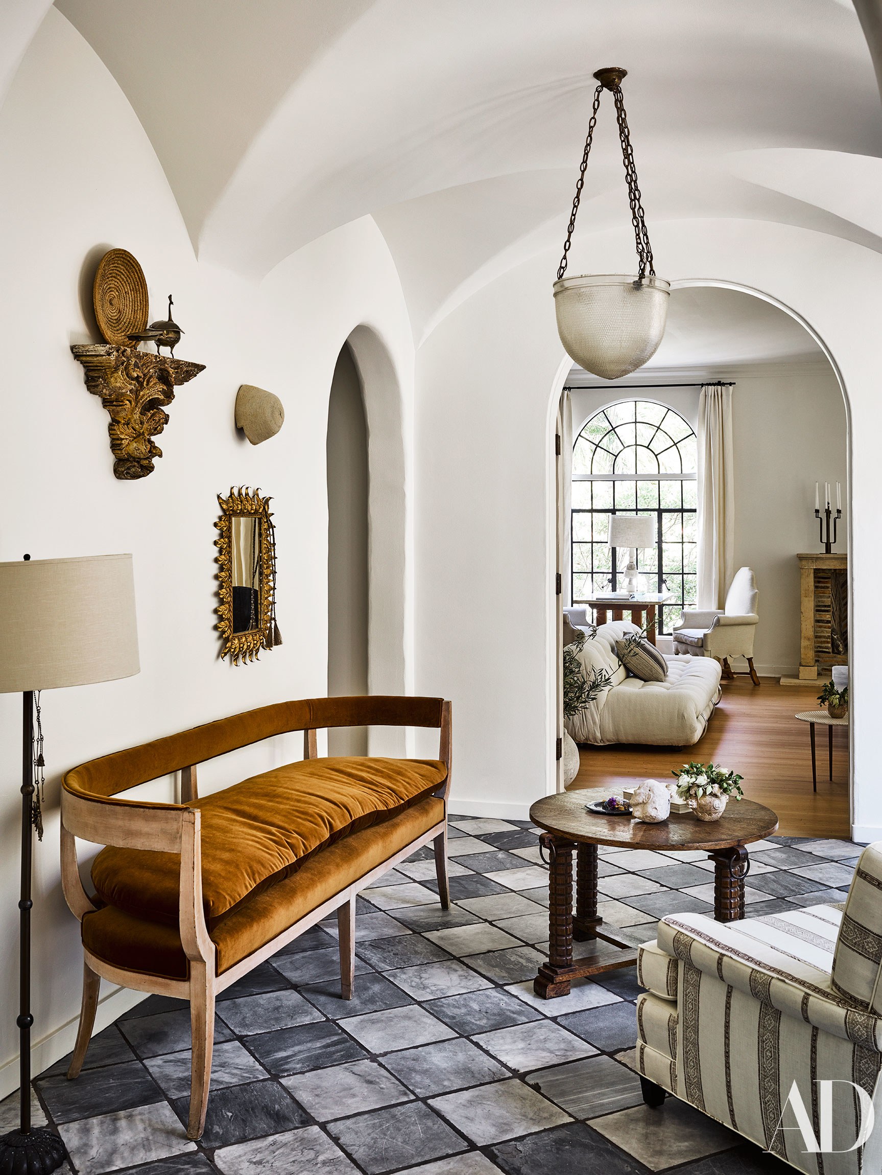
Vintage-Find me a beautiful room that does not have a touch of vintage or antique included…I dare you…There has been such a shift in our culture to re-use and re-purpose that vintage and antique home decor finds are at an all time high in popularity. Notice how your local thrift and antique stores are suddenly much pricier than in the past? There you go! Each vintage piece tells a story and is unique. Find something that captures a piece of your soul and bring it into your home.

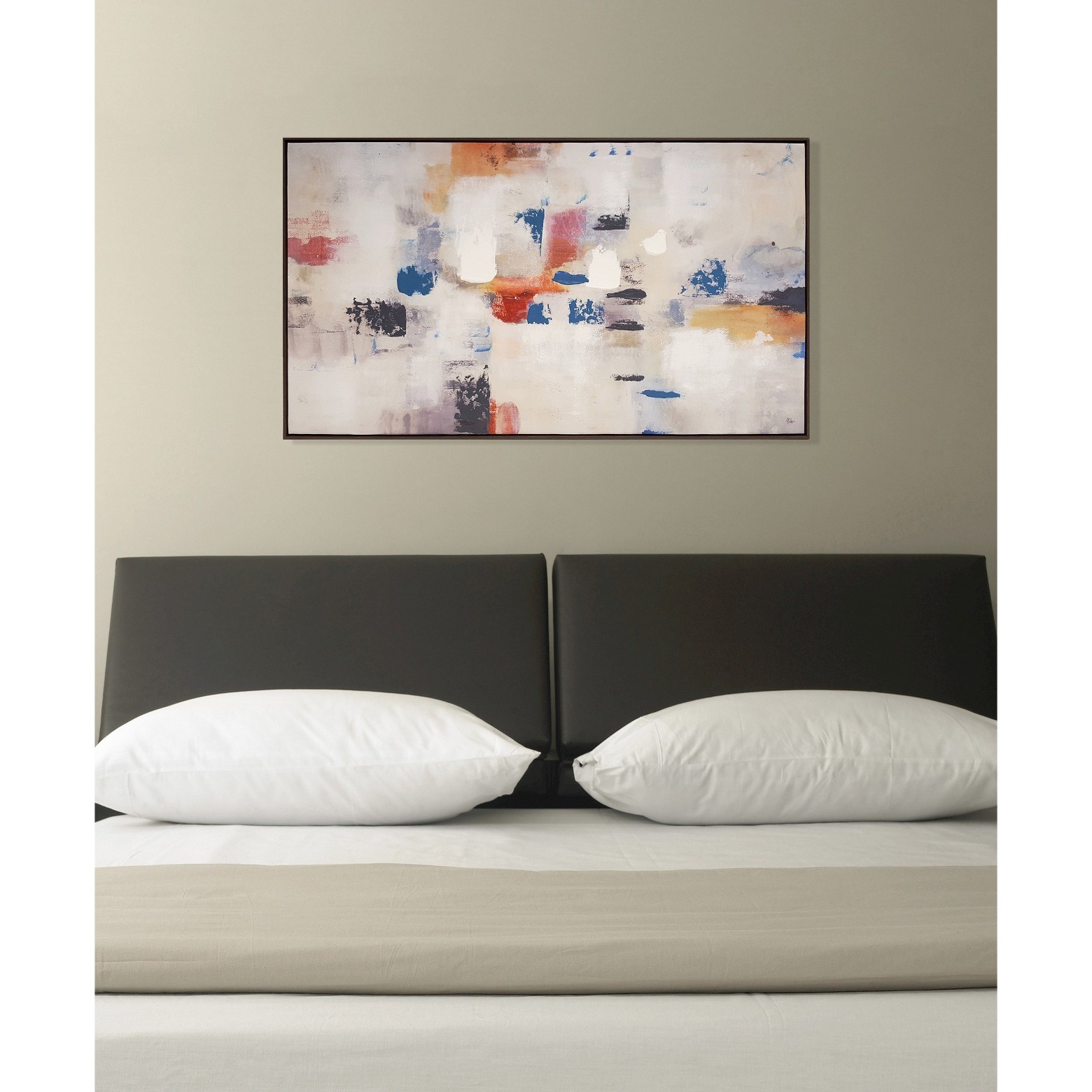
Modern-I used to be a gal all about Modern. As my design aesthetic evolved, I pulled away from it a bit but found that there was consistently at least one piece of modern furniture in every room I was drawn to. Look for classic and timeless lines so it can be versatile as you and your style change or evolve over the years

If you dig into each picture, almost all pictures are great examples of the Rule of 8.

Next week is REVEAL week and you will see how I incorporated my formula into our 150 sq ft of sunroom.

Thank you to our hosts Linda from Calling It Home and Media Partner Better Homes and Gardens. Be sure to swing by the ORC page to check out what is cookin’ with the other participants!

ORC-Guest-400white.jpg

Reupholstering Furniture-One Room Challenge Week Four

I blinked and it was week four of the One Room Challenge. Between work travel, client projects, vet appointments, fertility appointments, and some Netflix in between, I have no idea where time has gone!

After the horrendous painted concrete floor disaster last week, we are now getting to fun part. The foundation has been laid. The floors and walls are painted (two extremely tedious paint jobs), floor to ceiling and wall to wall black sheers are up, and the moody setting is the perfect canvas for the furniture and accessories that will soon be filling the room.

The sunroom is right off of our living room but it really is not used that much. During the summer, we may hang in the room in the evening but during the cold months, it is pretty much a room that we pass through in order to let the pups out.

Budget is always important when designing any space, but this time it was extra important. Between the non-stop vet visits (senior dog ownership is tough but rewarding) and our upcoming IVF, I had to be extremely mindful on where the dollars were being spent. With design being such a big part of my life, I have procured (**clears throat** hoarded) so much furniture and decor over the years.

When I decided to transform the sunroom, I spent some time at the Saher Antique Store aka my basement. I had several chairs, but only one pair. These Alky Chairs have seen better days but I picked them up for $100 each + $100 delivery. If you do a quick google search you will see that I got a heck-of-a good deal! These lovely ladies have been chillin’ in the basement for a couple of years and did not know when/where I would use them. No time like the present!

IMG_2159.jpeg

As I have shared before, I am drawn to neutral palettes. When well done, I find them timeless, luxurious, and often look more polished (IMO!) and refined. When picking upholstery for the chairs, I wanted something that would be unique but also continue the palette we have in our home. I chose this velvet by Fabricut in the color Whiskey. Excuse the little pieces of fuzz….it has been traveling in my purse for some time as I was trying to find a rug for weeks!

IMG_0154-1.jpg

This was my first time getting anything professionally reupholstered **GASP** I was referred to a local reupholster by a friend and he did not disappoint. He reupholstered these beauties for $!80 each!

I could not be more pleased with how they turned out. Depending on the light, the fabric pulls gold, brown, caramel….it’s just gorgeous. While this is technically a color, it works seamlessly in a neutral palette as it complements all my favorite neutrals….black, marble, wood, white, gray…..and yes, I consider materials a color. :)

IMG_0066.jpg

Would I get a piece upholstered again? Absolutely!

TIPS:

  • Be mindful of the base price of the piece. Fabric can quickly add up so make sure it financially makes sense to do this. Vintage/antique pieces with great lines and good bones would be a great investment if you are able to score a good deal. Check out FB Marketplace, Craigslist, Ebay, Etsy, and your local thrift stores for some potentially great finds.

  • Fabric-My advice is to pick a fabric that is timeless and versatile. When I originally purchased these chairs, I had plans to reupholster them in a blueish black zebra print but I would have been so limited on when/how I could use them. I am much happier with a choice that will be timeless.

  • Ask for recommendations! Vintage pieces have unique lines that all reupholsters may not be comfortable with. Be sure to ask for recommendations specific to vintage furniture.

  • Lead Time-Expect the work to take weeks so be sure to arrange this ahead in the event you are in a time crunch. This was one of the first things I did for the ORC as I knew it would take a few weeks to get them back.

We are only two weeks away from the reveal and I am thrilled with the progress in the room. Next week I will be sharing you my go to formula for a room!

Don’t forget to check out the progress of the other participants! Thanks to Linda from Calling it Home and Media Partner, Better Homes and Gardens for sponsoring another round of this fun event.

ORC-Guest-400white.jpg

When Life Hands You Lemons, You Paint.....One Room Challenge, Week Three

Week Three. I can’t believe it. Time sure does seem to fly lately! If you are new to House Haus Home (HHH), welcome! If you are returning, thanks for coming back! If you have been following with our One Room Challenge Transformation, we have completed the walls, windows, and are onto the floors. If you haven’t checked out the progress be sure to take a peek at week one and two.

If you saw my stories last week, I shared our new plan for flooring. Originally we had planned to do a polished concrete slab….then we planned on tiling. As always, we seems to run into issues with contractors either not showing up or showing up and then never sending a quote (WHY ?!?!) I did get one quote from a really nice man who I may use for another project but life happened and we decided not to move forward with the tile.

As many of you know, we have been working through some fertility challenges for over a year. Long story short, we were about to start IVF when our insurance company (our plan does cover IVF) caused a giant hiccup and that is still not resolved. We may have to pay for all the fertility drugs out of pocket (goodbye money) so I needed to reserve our tile fund for baby making and look for an alternative.

I was in bed and couldn’t sleep and was playing on good ole instagram when I was watching a story by the amazing artist William McClure. William is not only known for his beautiful works of art, but also creating clean and organic interiors. His signature white floors always looks beautiful but when I watched the transformation of the flooring in his new home, a lightbulb went off. Why not just paint them?

image via William McClure

image via William McClure

I was initially hesitant to paint them given we have four dogs, but after some research, I saw many pet owners have white painted floors. Yes, this could be disastrous, but it’s just paint. I came across a tutorial by Vintage Revivals and used it as guidance. She recommends a top coat for easier cleaning so I researched this and it appears to be a product with great reviews.

The process was pretty easy for us. Once the tile was removed (nice use of an entire weekend), we cleaned and cleaned and cleaned and cleaned. Did I mention we cleaned? When we thought we were done cleaning, we cleaned some more.

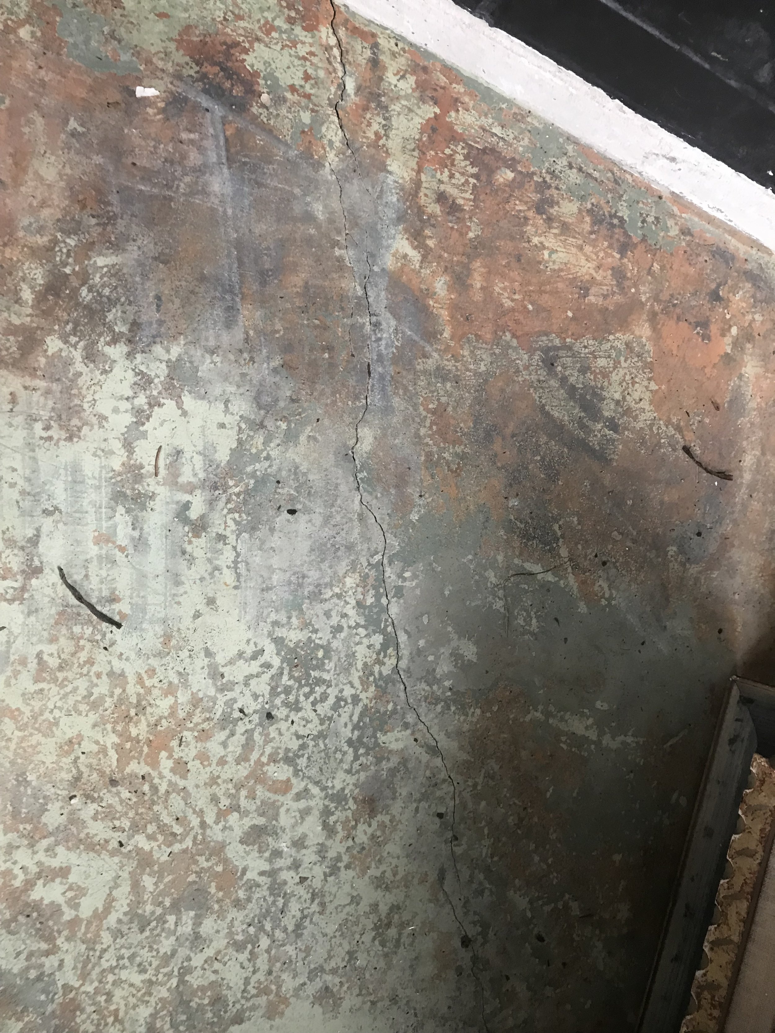
Our base floors were not perfect. There were some hairline cracks and dings. I used this product that I picked up from Lowes and basically patched it exactly like you would patch a hole in the wall. It’s self leveling and really easy to use. If you have a deeper hole, you can fill it with sand first or add multiple layers of this product. The instructions on the bottle were pretty easy to follow.

IMG_2684.jpg

One all the holes were patched, I vacuumed a few more times and then the painting began. Painting is the DIY home task I despise the most. I put on some jams and started the floors exactly like I would a wall-cutting in. Since I still had to touch up the last two inches of brick, I wasn’t overly concerned with it being perfect. Once that was done, I literally poured paint on the floor in sections and painted myself out the door. SW recommends waiting 4 hours between coats, but I waited 24 hours.

IMG_2717.jpg

In all, I painted three coats of paint on the floor. I used our Dyson cordless very gently each day I painted a new coat to minimize any debris that would be carried in with my clothes.

After the paint had cured, it was time for the top coat…….that is when everything when my hard work went down the drain. DO NOT USE A TOP COAT OVER THE SHERWIN WILLIAMS PORCH PAINT.

If you follow my stories, I shared that the porch paint and top coat had a chemical reaction causing both a ripple effect and cracking (remember that 90s faux finish? Barf.) I called my local SW store and the manager had major concerns that one of her staff advised me to use it. I shared with her where I got the information and she was like “umm no”. Maybe it works for some people-it definitely didn’t work for us.

IMG_0025.jpg

After a ton of sanding and re-cleaning, I added one more coat. Is it perfect? Absolutely not. It definitely helped but the only way to have gotten it perfect was to chemically remove the finish. Since I was putting a larger rug down, I decided that we can accept the imperfections as it is part of our ORC story.

In any event, this was the week one of the tedious weeks but I am excited because now that the floors are done, the fun part can start! Thank you to Linda from Calling It Home and Media Sponsor, Better Homes and Garden for this event. Be sure to check out what the other guest participants are up to over on the ORC Blog!

From the Window.....to the Wall, One Room Challenge Week Two-Spring 2019

Random fact. I am obsessed with the above titled song and sing it with waaaaaaay too much enthusiasm when I hear it. Another random fact, I googled the lyrics and was taken to Urban Dictionary and I am really disappointed to read what it allegedly means.

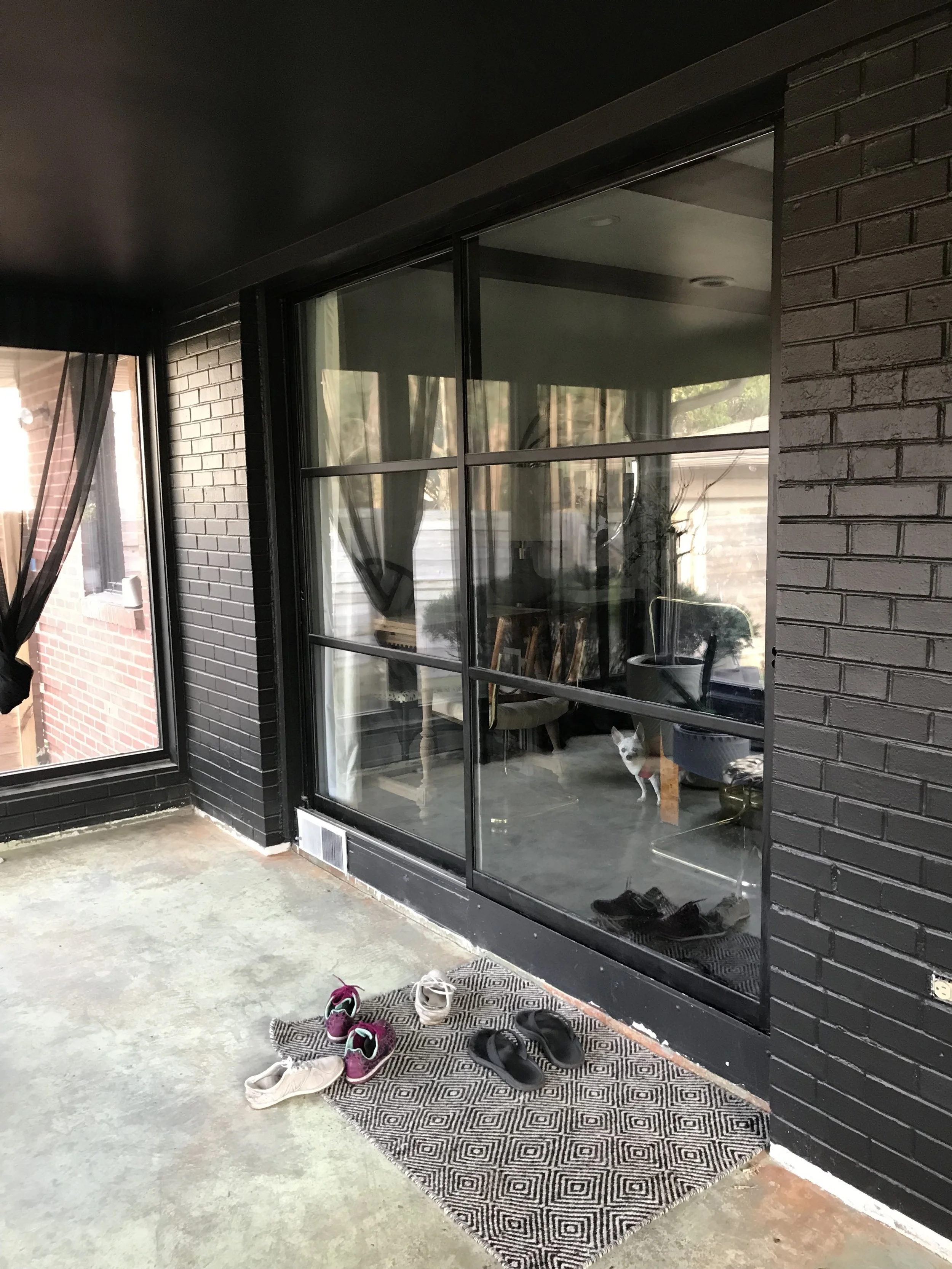
Back to the topic at hand, welcome to week two of the One Room Challenge. This week we are talking about all things walls and windows. Our sunroom does not really have much “wall”. We have a beautiful room surrounded by three “walls” of windows. One “wall” has an original sliding MCM door that was painted black many moons ago.

Whenever I go to my local Benjamin Moore store (FYI for you local peeps-I highly recommend Everyday Paint and Wallpaper in Nora, really great people with tons of knowledge!), he asks me what projects I am working on. I am pretty sure he thought I was bats—t cray-zay when I said the black paint I ordered was for a SUNroom.

I always like to add a bit of unexpected to a room. While most people would never dream to paint a sunroom black, dark walls can create a moody and inviting space. Given the room is more or less is surrounded by windows, we are constantly getting beautiful (though mainly indirect) light coming through the floor to ceiling windows.

IMG_2667.jpg

Black paint was added to add a dramatic effect and tie the colors into the main floor of the house. Even the ceiling was painted black!

IMG_2668.jpg
IMG_2669.jpg

Part of renovating is the reality that things do not always go as you plan. You will notice that there is a 2-3 inch line across the bottom of the wall that is not painted. We painted BEFORE we realized we are going to have to demo the floors due to a change in plans (hey, life happens). There will be lots of repainting and cleaning of that bottom area. If you have demo’d anything before you probably understand the mess that creates. Lots and lots of dust.

Also added this week, are black sheer curtains from wall to wall. These were super affordable and purchased here. The curtain rods were hung up soon after we moved in and were placed as close to the ceiling as possible. Unfortunately they are sold out, but these Umbra ones are super similar. I am a sucker for simple curtain rods with clean lines. The curtains are a couple of inches longer than the floor kissing length I like but given the sunroom vibe is more laid back, I am keeping them as is.

IMG_2670.jpg

There will be a lot of paint touching up prior to reveal day but for now, I am super pleased with the direction things are going. Next week, I HOPE to be sharing information on the floors. Fingers Crossed!!!

In the meantime, please head over to the One Room Challenge Blog page and check out both the guest and featured designers. Thank you so Linda from Calling it Home and Media Partner Better Homes and Gardens for hosting yet another great round of this event!

ORC-Guest-400x218-2.png

Spring 2019 One Room Challenge-Moody Sunroom Retreat

Life is funny. You have grand plans and then life intervenes and forces you to change the path you started. I hit the “duplicate” button on my one and only fall ORC post. It started with an intro on how I left my company and was starting with a new one….how happy I was…..and how I felt like myself again. My goal was to focus more on the blog but life had other plans. I quickly dropped out of the fall ORC for a couple of reasons. First, the fabric I wanted for my chairs was on backorder (and just arrived a few weeks ago!) and second (and more importantly), last fall was the start of non-stop health issues for my two oldest chihuahuas as well as the next steps in our (in)fertility journey. Guess what? 5-6 months later and nothing has changed on either front but I realized that I can’t stop living so here I am.

This will be my second time as a guest participant. I participated previously and transformed my home office space.

This time around, we are working on sunroom. This room is off of our living/dining room and is our main access to the back yard. Having four dogs means we are going in and out of this room multiple times a day. With my husband being OBSESSED with his yard, that also means lots of muddy shoes coming through this space.

Below are a couple of pictures from the MLS listing. The sunroom is right off the dining area and separated by original metal MCM sliding doors.

sunroom.jpg
21388210_18_0.jpg

A Mid Century purist would probably cringe at the fact that I hate these floors, but I hate them. Our house is a split level MCM style but it isn’t too “mid century’ so I do not feel bad eliminating them.

THE PLAN

orcsunroom.png

COLOR: Black. Black. Black. The room was inspired by the kitchen area of The Handmaid’s Tale. While most people seem to love bright white, open, and airy spaces, I crave darkness. I find comfort and peace with moody spaces. So while it may seem counterintuitive to paint a sunroom black, I believe this will create a inviting and warm space for us to relax in. Because I value my privacy, all the windows will be covered in flowing sheer black drapery. It will still allow light to filter in but not let our neighbor peek in.

NATURE: Our sunroom has three walls of windows and is north facing. We have a fairly wooded lot so we do not get a ton of bright light but we do get enough to be a thriving place for certain types of plants. The room will have several plants introduced the space. Despite the fact it does not get a ton of direct sun, plants have historically thrived in this room. The one obstacle is watering them in the winter as that has resulted in the sudden unfortunate deaths of several plans due to freezing roots.

FLOORING: Now this is one of the most important aspects of the room due to heavy foot traffic. Two humans + four dogs + a cat who thinks planters are his bed= need durable flooring. Candidly, I do not know what the plan is for flooring. Life and time will determine what we will do. We have funds set aside for the floor but may need it for IVF medicine (thanks insurance) so we will have to wait and see.

FURNITURE: I have sourced a few pieces since the last attempt of the ORC. Two beautiful vintage Alky chairs will be transformed with the above ochre velvet fabric. Every room needs some wood and this room is no exception. A vintage desk will be welcomed into the space and will probably serve as the station for preserving and pressing flowers (my new obsession). I scored a gorgeous black marble plinth coffee table off good ole Marketplace. I still need to determine some additional seating, a rug, and minimal decor.

LIGHTING: We currently have two recessed LED lights in the room. They are bright and harsh. we never use them. I would love to covert these lights into pendants and find some type of textural pendant light (woven, rattan, etc.) Hello Leanne Ford for Target?!? We will see.

Candidly, I am winging this guys! As a last minute registration and a mind full of ideas, who knows what we will end up with. Hopefully you guys will fall along on the journey during the next 6 weeks and see what each week will bring! Be sure to go look at all the other great projects that are happening over at the ORC Blog!

ORC-Guest-400white.jpg

A BERRY MERRY CHRISTMAS

I like a good pun, don’t you? When I needed a name for this blog post, I was trying to determine what the name of the color was in our Holiday decor….wine? merlot? burgundy? I chose Berry just so I could name the post “A Berry Merry Christmas”. HA!

Once again, I am participating in the Winter Eclectic Home Tour Hosted by Jessica Rey of Domicile 37 (thank you for having me!) I cannot believe it is Christmas time already. I feel like I just put away our holiday cheer into those big plastic totes and tucked them away, but here we are again. I have a love/hate relationship with decorating for holidays. I hate bringing more items into a room as it often makes it feel cluttered. On the other hand, I hate removing my precious items because so many of my decor finds are very special to me. This year I tried to find a balance by swapping out a few things and keeping it overall very minimal.

While our normal holiday styling is usually pretty neutral, I was inspired by a CB2 holiday ad and wanted to use this rich berry color within our home.

IMG_0426.jpg

I reached out to the owner of Willow and Star Flowers, Allyson Wells Podell, for some guidance on finding the winning combinations of flowers. With her help, I landed on a mix of anemones, naked seeded eucalyptus, tinted eucalyptus, poppy seed pods, and scabiosa seed pods. I threw in some preserved burgundy stems I had leftover from thanksgiving to add some depth and additional color. All but two of the flowers on the tree are real (preserved) but I did have to rely on good ole silk for the tinted eucalyptus and anemone. I would love to grow my collection of preserved flowers and to build on this for next year!

IMG_0428.jpg

Underneath the tree are my favorite gift boxes from Target. These have been around for years and come in different colors each season. I used some lush berry and green velvet to garnish the simple boxes and all lay on this faux fur tree skirt that I have been using for years.

IMG_0431.jpg

I wanted to keep our mantle very simple this year. I draped my favorite cedar garland asymmetrically to give it a bit of uniqueness and kept the stockings to one side this year to avoid the clutter of 5 stockings (yes, the dogs have stockings!)

Faux LED candles adorn the top along with some velvet ornaments from Hobby Lobby. While our tree did not have any traditional ornaments, I use them within the mantle and to fill bowls.

IMG_0338.jpg
IMG_0339.jpg
IMG_0341.jpg

Generally I don’t decorate our railings/entry too much since it is not being renovated. However, since we have these beautiful new railings, I thought I might as well. The pictures will show the reality of a reno in the background but hey, it’s real life!

IMG_0350.jpg

Well, folks, that’s all I have to share with you thus far. To say we are behind with filling our home with festive goods would be an understatement. Sometimes life just happens and you have to go with the flow. I am shooting to finish up our holiday decor over the weekend and I will share the rest with you via good ole Instagram.

Thank you again to our Host, Jessica Rey, for hosting this fun blog hop. Be sure to swing by the other tours for some lovely home decor eye candy!

2018 Spring Home Tour

When the lovely Jewel of Jeweled Interiors told me about the Spring Home Tour hosted by Monica of Monica Wants It, I was all game.  I have been so busy with work and other people's homes, that I have neglected mine!

Well, then life happened and I had an unexpected work trip to Jersey (GTL, baby....people probably don't say that anymore, do they?) and was a victim of the dreaded flu.  I had grand plans to complete for the tour BUT it ended up being more of a little refresh! :)

If you are new to House Haus Home, welcome to our home!  My name is Saher and I am married (Chris) with four dogs (Chico, Joey, Dash, and, Andie) and a cat (Rex).  We are currently renovating a split level Mid Century Modern home in Indianapolis.  

I have not updated my blog or website recently, but here is the last time I photographed the living room to give you an idea of the "before"

When most people hear "spring", I am sure they think of bright and vibrant colors....flowers....butterflies...birds.....and sunshine.  What do I think of? Flowers, of course....and textures!  As someone who is drawn to neutral spaces (let's be real-color in my home makes me anxious), a spring refresh meant changing out textures such as swapping fur throws and velvet pillows for lighter options such as linen or cotton.  

I also wanted the space to feel more relaxed so I swapped out the brass/glass coffee table for this gorgeous black/white ottoman.  The ottoman was purchased from my favorite local home store, Shine Design Home.  Also, Chico seems pretty relaxed, don't ya think??


DSC_1264.jpg
DSC_1283.jpg

The ottoman is topped with this organic black tray from Restoration Hardware and filled with some of my favorite pretties.  I love mixing wood into the design in almost every room in our home.  The wood beads serves as a touch of nature and a nod to spring.

DSC_1285.jpg
DSC_1280.jpg
DSC_1273.jpg
DSC_1310.jpg
DSC_1293.jpg

My favorite little corner had just a few swaps.  The vintage brass mushroom lamp was replaced with this gorgeous alabaster orb light.  I love how it glows at night and love the depth of the stone during the day.  By removing the brass lamp, I feel the room is less "glam" and lighter.

Can we just talk about that peek of the beautiful hand blocked pillows by Ruth and Rhoda.  I love the subtle added print against the large black sectional.

DSC_1304.jpg
DSC_1306.jpg

Moving around the room, the brass shelf had one small update on the bottom shelf.  The large wood chain was moved to the dining area and replaced with this gorgeous wooden carved cobra From JKC Vintage Decor(be sure to check her out on Instagram!).  

Bringing in more nature for spring, this little vignette is topped with this sculptural paper mâché bowl and these gorgeous wood balls.  I love the organic shape of them!

DSC_1318.jpg

To the left of the brass shelf is our TV area.  Yes, I am interior designer who has a TV in her living room.  I told you that I would keep it real!  I left it out of the photo so we can focus on these gorgeous branches that I picked up from Trader Joes.  They have started to bloom and although I despise the smell (floral scents give me a migraine!) but luckily you can only smell them when you get close.  

I am a sucker for branches and will pick them over flowers or a plant any day!  I love how the light pink color pairs with the wood bowl and African beads.

DSC_1284.jpg

As we continue around the room, we are met with some more texture with these natural African gourd baskets.  I lucked out by finding the first one during a floor sale at my local RH.  

DSC_1290.jpg

I kept the bar area the same since I pretty much LOVE it as is...that's a pretty big deal for me...two years and no changes (you designer lovers know what I mean? ;) )

DSC_1286.jpg
DSC_1314.jpg

I added some of those beautiful branches to the mantel area as well.  I wish these branches could look like this all year long!  I would actually have some color in my house, if they did!  Accompanying the branches are a set of abstract bird vases.  Do you see the birdies?  I love the curves and matte black finish of them.  

DSC_1322.jpg
DSC_1279.jpg

The opposite shelf has had a full facelift.  Lush feathers with the tribal necklace, cast iron bowls, and this vintage-esq looking pottery fill the shelves on this side of the room.  

I had high hopes for a full dining room makeover prior to this tour but unfortunately that is going to have to wait.  I have big plans to reupholster the chairs, change out the rug, switch the lamps and maybe even DIY an oak cerused dining table. My love/hate relationship with the Ostriches continues.....

I moved the large chain link to the dining area and added this bright green succulent.  It has a topiary shape and several shades of green that scream spring.  

So there you have it!  My first ever spring tour.  I hope you enjoyed viewing our version of Spring!  Try and think outside the box and find your style.  It does not have to be a literal interpretation of a theme, but should be what feels right to you!  

Head over to Cassie's tour and check out her amazing home!  Thanks for stopping by! 


A Letter to Myself on my 37th Year

We are two weeks into 2018 and I have yet to discuss "resolutions".  I am not one who makes resolutions.  I never stick to them!  Instead, I list goals.  2017 was a very good year.  It was a year of changes, it was a year of challenges, but it was a year of results.  

                                                                      &nbs…

                                                                           photo by Grace and Jaden Photography

Sometimes, I think we (humans) are afraid to say what we want out loud and to share them with others as it can make us vulnerable.  What if I don't accomplish these goals? What if people see me struggle and fail? What if people judge me?  

So, this year, I am writing a letter to myself.  


Happy Birthday, Saher!  Today you are 37.  You are closer to 40 than 30.  Your joints hurt in places you did not know could hurt, you don't heal the same, but you are alive and well.

You have always been a late bloomer in life.  You take a bit longer to find the path to the destination you desire, but you find your way.  You are fierce, you are independent, and you are full of passion.  However, your fear failure holds you back by stopping you from taking risks.  The risk vs. reward for the life you want is worth it, so go for it.  

On this 37th year, I wish you the following accomplishments both professionally and personally.

Professionally

  • Continue to grow and expand your design knowledge and business.  Be proud of what you have accomplished since launching just a few months ago (you have 4 new clients in 6 weeks!).  Do not compare your beginning to someone else's middle or end.  While days can be tough and you may question why you are taking on so much, do not forget your end goal....to live a life filled with happiness, creativity, independence and passion.  
  • Grow your Instagram to 5,000 by year end.  This is REALLY hard for you to say out loud, so I will say it for you.  Put yourself out there, connect and network, make friends, and be yourself.  DO NOT COMPARE YOURSELF TO OTHERS!  You will need support from others to do this.  Do not be afraid.  
  • Be published.  Submit your work to various online or local publications and try to share your work with others.  It is OK to try and then fail but you will never know unless you try!
                                                photo by Rebecca Shehorn

                                                photo by Rebecca Shehorn

Personally

  • Focus on your health.  The end of 2017 had you unexpectedly in the hospital, having surgery, and overall feeling not in the best of health.  Your body should be your temple.  Treat it that way.  Give up the foods and behaviors that are poisonous to your body and soul.  Eat more vegetables. Eat less meat.  Drink more water. Exercise. Go to the doctor. Deal with issues instead of hiding from them.
  • Children.  Yes, you are 37.  Yes, it's harder to have a child at this age, but it can happen.  Take care of your health and make the dream of motherhood become a reality.
  • Volunteer consistently.  Yes, you volunteer more than most of the people you know, but volunteering has such an impact to both you and the people/animals you help that you must do it MORE.  

May the next year of your life, be the best one yet.  Work hard, but play hard.  Your dreams are waiting for you...go and get them!

                                                                      phot…

                                                                      photo by Grace and Jaden Photography

2018-Interior Design Trends: Goodbyes and Hellos in the New Year

It seems like just yesterday that we were all freaking out about Y2K and here we are in 2018.  Crazy?!

In the design world, it is the time of year that various news/design sources list the trends of the upcoming year.  While I am not a trend forecaster, I do have some things I would love to see more of.....and some things that I really hope are left behind.  Below are my top 5 of each.  

Disclaimer:  These are my own personal opinions and if you love or have one of these trends that I am not a fan of in your home, please do not take it personally!  We all have our own styles and I respect them all.  I still love you and hope you still love me!

GOODBYE

1.  Macrame:  With boho being super trendy right now, it seems that Macrame is EVERYWHERE.  Heck, I can find cool ones at Home Goods for $12.99.  Just do a quick google search of "macrame" and hit the shopping tab and you will find every style imaginable.   

                                                                      &nbs…

                                                                        amazon

2.  The Fiddlehead Fig Tree:  I purchased my first fig tree about 6 years ago before they were readily available.  I had my sister buy it from someone on Craigslist in Chicago and transport it to Indy for me (She hates me because of my CL needs).  Since then, they are at every store: local nurseries, Lowes, Home Depot, and even Costco!  Yes, they add a beautiful touch of green and life to any space but these plants are ridiculously finicky and are ubiquitous.  Instead of the fiddle, why not try a beautiful olive tree or gingko tree?  I truly hope the fiddle has dropped its last leaf in 2017.
                                                                      &nbs…

                                                                          worldmarket

3.  Mass Produced Art and Wall Decor:  Go to target.com, type in "Art" and that's what I am talking about.  To me, art is one of the most important ways to personalize a home.  Yes, places like Target have some beautiful pieces of wall art/wall decor, but that piece is also going to be in the homes of thousands and thousands of people.  Also, why do people put wall art with their last name or last name initial?  Do you need to remember who lives there? (I have the same feeling when people tattoo their name or last name on their bodies).  There are so many affordable art solutions out there-go and find something special and add that to your home.  (I will be doing a full post on art soon!)
                                                                      &nbs…

                                                                                                                Target

4.  "Shiplap" aka Wood Paneling:  I know, I know.  Joanna Gaines is the darling of HGTV (FYI-Most HGTV shows actually have ghost designers and the "talent" isn't necessarily the one designing what you see.) Shiplap has taken over the design world along with the Modern Farmhouse design trend.  Other than the color/material, shiplap might as well be wood paneling from the 70s.  Heck-did you know they even make shiplap wallpaper?!  While I am all about bringing in texture and warmth to a room with wood, I definitely prefer the use of wall moulding.  There are endless options and it can be customized so your space is unique.


                                                                      &nbs…

                                                                          HGTV

5.  Open Shelving in Kitchens-This one may lose me some followers but please hear me out!  It seems that every major kitchen remodel that the social media world is obsessing over does not have upper cabinets.  It looks sleek and clean but WHERE ON EARTH DID YOU PUT ALL YOUR STUFF?  Storage, in my opinion, is one of the most essential parts of a functional kitchen.  Instead of eliminating all your uppers, add a small area of open shelving for a coffee area or to display cookbooks.   

open.jpg

Honorable Mentions:  All white kitchens, Orchids, Chevron, Painted Furniture, Basic word art/inspiration art, Industrial Materials, the color Gray, and Edison Bulbs (but I need a replacement!)


HELLO

1. Textures (example: Wood, Concrete)  There was a time I was very anti-wood.  Well, wood that looked like wood.  I was once in the school of "give me all that painted wood furniture and MDF".  The warmth that both wood and concrete can bring into a space...well, it just gives me goosebumps.  Both of these materials can add color and texture to a space without the use of paint.  Their ability to elevate the design of a room from pedestrian to professional is amazing.  

                                                                      &nbs…

                                                                                                     House Haus Home

                                                                      &nbs…

                                                                                                               Studio McGee

2.  Antiques and Vintage Items:  Like most people, I am guilty of walking into Target and buying all the new items of whatever collection has just launched.  They are cute and affordable and it's so easy to have that quick shopping fix.  However, I have banned myself from doing this.  They end up sitting in a closet and I just waste my money.  I still pick up the occasional items (I like target for staples like vases, trays, frames, etc.)  Most of my favorite items are vintage though and I hope to see more of these types of items in homes in the upcoming year.  


                                                                      &nbs…

                                                                                                  Rosie Case via Sketch42

3. Branches/Stems in lieu of traditional flowers-I am currently OBSESSED with branches.  I am a wee bit over orchids and peonies right now...sorrrrrrry.  The sculptural element that branches can add to a room can take your design from blah to wow!  Some suggestions:  Olive branches, eucalyptus (they have so many varieties), magnolia branches, and so on.  Don't overlook what you have in your own yard either!


                                                             Little Green Notebook

                                                             Little Green Notebook

4.  Textiles-I once read an interview with Shea McGee of McGee and Co. about how she felt textiles (aka fabric) is one of the areas to splurge in a room.  At the time, I did not agree but now, I am totally on board.  In 2018, I hope to see more use of beautiful fabrics whether printed or solids, mixed patterns, and lush textures.  These can be incorporated with throw pillows, drapery, bedding, upholstery, or anywhere else you like.  My neutral loving heart is even feeling adding some jewel tones in velvet.

Some examples:

Jeremiah Brent via Architectural Digest/William Sonoma/ House Seven Design/ Natasha Habermann

5.  DIY-Is there really an original idea anymore?  Very few, if you ask me! While it is easy to buy something, the satisfaction of making your own can be incredibly rewarding.  There is inspiration everywhere you look.  Why not make your own home decor and personalize it for your space?  Not only will you have a budget friendly piece of decor, when someone asks where you got it you can say "I made it!".  The below black beads are an affordable DIY that will be posted on the blog this year. 

beads.jpg

Honorable Mentions:  Dark/Moody Walls, Brass, Mixed Metals, Wallpaper, Sculptural Elements, Organic/Natural Items (examples: geodes, driftwood, faux fur), Oversized plants (not the Fiddle, though!), Rattan or other natural materials, and more Black.

So there you have it!  Hopefully this short list gave you some food for thought as you plan your designs for 2018.  I would love to hear from you!  What are some trends that you are digging and what do you find to be soooooo 2017?


Five Styles of Christmas: Modern Eclectic Holiday Decor Tour

Happy Friday and 9 days til Christmas!  I am excited to share Part II of our Holiday Tour with you!  Last week, I shared the first part of our tour which focused on our main living spaces.  At this time, our holiday decor is limited to our a portion of our first floor.  As our family (hopefully) grows, I may extend this into bedrooms and also decorate spaces that have currently not been renovated.  If a room is not renovated yet....it doesn't get any love!

Today I am excited to share with you our entry, kitchen, and a touch of holiday in our powder room.  I have also taken some nighttime shots of the living/dining room which shows holiday decor at night with the the magic of Christmas lights!

I have not really shared many pictures of our kitchen yet.  There are still some finishing touches that need to be completed but I thought I would share the current situation.

The Christmas touches in our kitchen are simple.  A couple of wreaths have been added to bring in some beautiful greenery into a very white room.  

Our cactus (yes, it's real) has been wrapped in twinkle lights and topped up with some playful reindeer antlers.  

More fresh eucalyptus dresses our vent hood and a different variety serves as a simple centerpiece for our breakfast nook.  

The branches by our sink are foraged from the PNW.  This is a place close to my heart as we were married on Cannon Beach and I fell in love with the PNW during my honeymoon.  

DSC_1152.jpg
DSC_1137.jpg
DSC_1129.jpg
DSC_1131.jpg
DSC_1132.jpg
DSC_1135.jpg
DSC_1118.jpg
DSC_1124.jpg
DSC_1142.jpg

Unfortunately, I do not have the proper camera equipment to photograph small spaces (Ohhhhh Rebecca!!! :) ).  I have a total of one powder room bath picture that I was able to photograph.  I kept it super simple in the bathroom and added fresh eucalyptus in lieu of the usual rose.


DSC_1164.jpg

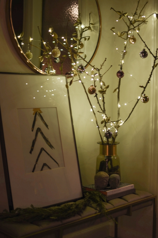
Our entryway is not yet complete, but I still wanted to add some Christmas cheer for our guests to see when they walk in.  I added lights and ornaments our current entryway decor.  I added some fresh garland and a quick DIY art (yeah yeah, I know it looks like a 5 year old made it).  

DSC_1109.jpg

Now, I am really excited to share the night time tour of our living and dining room.  I am at a 1st grade level with use of my DSLR camera but overall, I am pretty pleased with how these pictures turned out.  I LOVE sitting in our living room with the Christmas lights on, a lit candle, hot tea, and some cheesy Netflix movie.  Have you seen A Christmas Prince? Christmas in the Smokies? A Christmas Kiss? I love me some Lifetime-esque themed holiday movies. 

DSC_1244.jpg
DSC_1240.jpg
DSC_1246.jpg
DSC_1200.jpg
DSC_1196.jpg
DSC_1205.jpg
DSC_1193.jpg

Our dining area glows with the help of these little battery operated tea lights.  They are such a great deal at $10 for 24 lights!

The tea houses are a buy from an after Christmas sale.  However, similar ones can be found at Target here and here.  You can make them your own by painting them and adding details such as gold garland, painted roofs, etc.  The sky is the limit!

DSC_1174.jpg
DSC_1189.jpg

The mercury glass votive holders are from West Elm and World Market.  Both are very budget friendly options and really add a touch of subtle Christmas decor to a space.  

DSC_1178.jpg
DSC_1183.jpg
DSC_1182.jpg

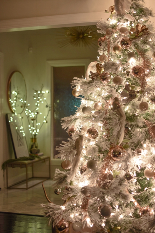
And here our tree glows in all her glory.  She is the heart of the decor and omits the most beautiful warm glow.  The light highlights the flocked goodness of the pine and reflects different colors of lights off the various glass ball ornaments.  

DSC_1212.jpg
DSC_1231.jpg
DSC_1208.jpg
DSC_1221.jpg

Well folks, that brings us to the end of my tour and the week of tours.  No matter what style you love, there are so many ways to bring in holiday decor into your home in a unique and special way.  Hopefully you found some inspiration during the week!  Thanks so much for following along! 

xo

Saher 

Holiday Home Tours-Five Styles of Christmas

We had our first snowfall of the season here in Indianapolis over the weekend.  Christmas just never feels the same without this glistening white stuff on the ground.  I love the feeling of calm that falling snow brings....for just that moment, the world feels silent and everything feels safe. 

                                                                      &nbs…

                                                                                        Throwback to our first snowfall in 2012

If it did not already feel like Christmas was around the corner, having snow on the ground sure does make it real!  Last week I participated in my first holiday home tour hosted by Jess Rey of Domicile 37.

This week, I am hosting a Holiday Home Tour featuring these amazing bloggers and ladies of diverse styles.

Monday:  Desert Domicile 

DDtree.jpg


Tuesday: Casa Cavaliere

IMG_5353.jpeg

Wednesday: The Rath Project

rath.jpg
IMG_5352.jpeg

Friday: House Haus Home 


DSC_1056.jpg

Each blogger has a unique and diverse style that I am sure will knock your holiday socks off! 

I will be sharing our entryway, kitchen, and also a night tour of our home later in the week.  Lights and nature are the stars of our decor this year and the day time does not do it justice.

Head over to Desert Domicile for the first tour of Caitlin's beautiful and festive home.


Eclectic Home Tour: Welcome to Our Wooded Winter Wonderland

Merry *early* Christmas!  I am so excited to have been invited by Jess from Domicile 37  to join her Christmas 2017 Eclectic Home Tour!  If you are visiting from her page or any of the other participating designers, welcome to House Haus Home!

DSC_1093.jpg

When I was first invited to join the tour, I thought, "Am I eclectic?"  

Webster's Definition:

eclectic

adjective   eclec·tic   \  i-ˈklek-tik ,  e- \'

Definition of eclectic

1: composed of elements drawn from various sources;  

2: selecting what appears to be best in various doctrines, methods, or styles


Well, ladies and gentlemen, it appears that I am!

Now onto our tour!

Sticking to my neutral palette, I found myself drawn to bringing nature into our home this year.  Our tree is a 7 foot flocked tree decorated with a mixture of blush, gold, silver, white, and glittery champagne ornaments.  The lights throughout the tree are a warm white. 

In addition to the basic ball ornaments, I added faux birds, flowers, and feathers to give the tree a glamorous, but natured inspired look.  

Our tree skirt white faux fur and brings a lush look of a blanket of snow as the base of our tree and presents.  The large brass deer is vintage and is finding himself a home under the flocked goodness this holiday season.

DSC_1076.jpg
DSC_1071.jpg
DSC_1075.jpg
DSC_1070.jpg
DSC_1073.jpg
DSC_1072.jpg

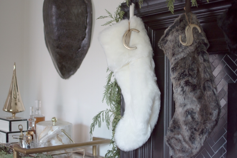
Overall, our holiday decor is pretty simple this year.  Our mantle is dressed with fresh cedar garland, mercury candle holders from West Elm, and a couple more vintage brass deer (I own a family of 6) as the main focal point.  

The bells are from Target from last season and the letter ornaments are from West Elm, but from a couple of seasons ago.  Our stockings are faux fur and are a mix of black, gray, and snow white.  I purchased mine from Home Goods years back but I have seen them every year since.  

The garland has small battery operated LED lights throughout and the glow that the various light sources bring to the room in the evening is magica

DSC_1056.jpg
DSC_1050.jpg
DSC_1082.jpg
DSC_1060.jpg

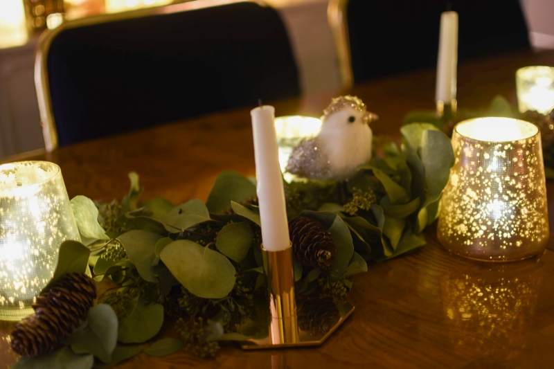
Moving into the dining room, the theme continues.  A beautiful eucalyptus garland with a mixture of candles, acorns, birds, and another member of the vintage deer family find themselves at home.  

The garland was made by Allyson, the owner of Willow and Star Flowers, here in Indianapolis.  I purchased the garland for Thanksgiving and at that time it had the most beautiful scent.  As the garland has dried, it still provides the green from nature and has lasted throughout the holidays.

DSC_1032.jpg
DSC_1031.jpg

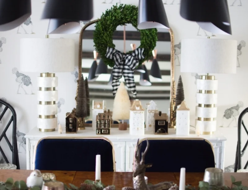
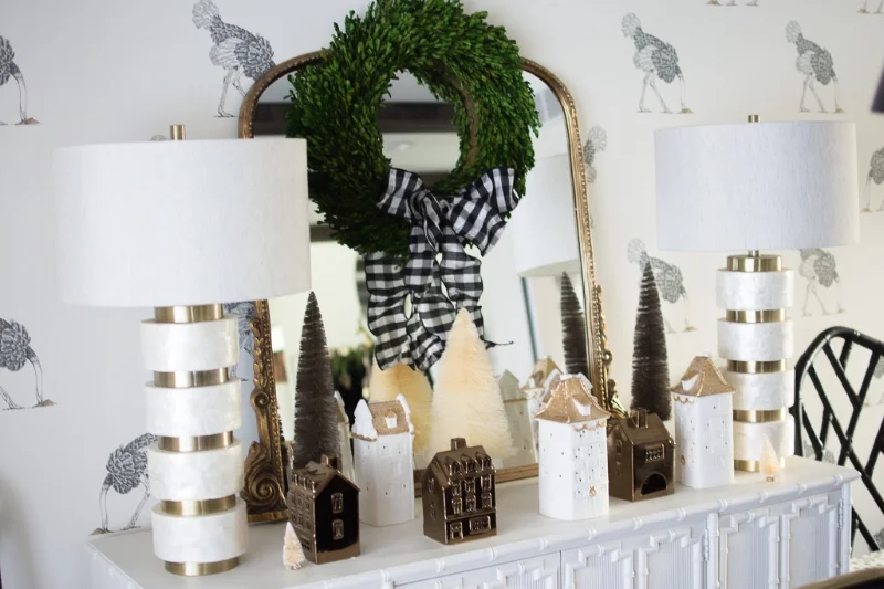
Behind the dining table, I have put together our little tea house village.  These light up and are a mixture of matte white, bronze, and touches of gold.  This color extends into the bottlebrush trees which are finds from Home Goods and Target.

DSC_1038.jpg
DSC_1037.jpg

The preserved boxwood wreath has a touch of buffalo plaid and is hung on my favorite Anthropologie mirror  (FYI-wait for a sale, the coupon code will apply!)

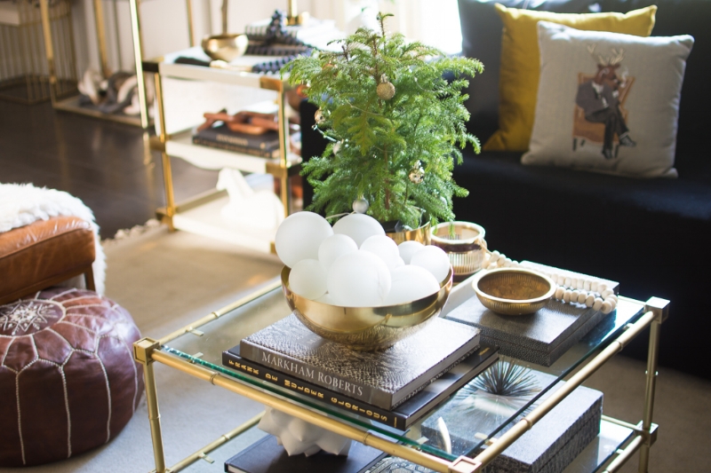
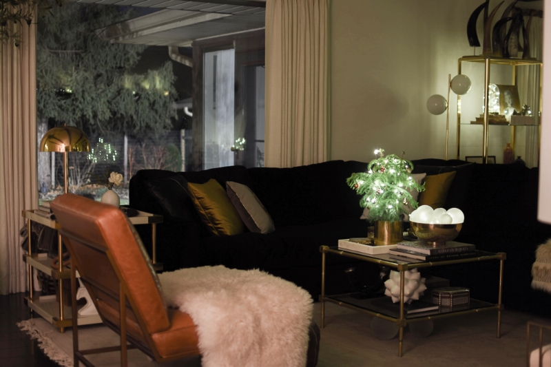
Our coffee table had a quick switch-a-roo of two items.  The mini Norfolk pine is from IKEA and has been decorated with mini ornaments and the same LED lights as previously mentioned.  

I DIY'd several items this year as I did not want to spend too much on holiday decor (Actually, most of the stuff was already owned)!  The brass bowl in the centerpiece is filled with two sizes of frosted glass balls from Hobby Lobby.  I strung the LED lights throughout several of them and the bowl gives off a beautiful glow at night. 

The pillows in the background are a mix  black leather, velvet chartreuse, and this cute Reindeer in smoking jacket.  He has a girlfriend on the other side of the couch. 

DSC_1011.jpg
DSC_1062.jpg
DSC_1058.jpg
DSC_1086.jpg
DSC_1089.jpg

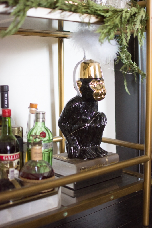
Similar to the coffee table, I only switched out a few items on our bar cart.  I brought in this gold glass Christmas tree, added some garland and lights, and Mr. Monkey is showing he can be a good boy with his angel headband.  I love adding a bit of whimsy to all of my designs.  

DSC_1047.jpg
DSC_1091.jpg
DSC_1053.jpg

 A few touches of Christmas were added to the shelves.  This DiY was super simple and I made it while making an Instastory! The branch on the inside comes from our own yard, the brass dome is from IKEA, the clear 4" ornament is from Hobby Lobby and my ole faithful lights are strung inside.  

DSC_1042.jpg
DSC_1044.jpg

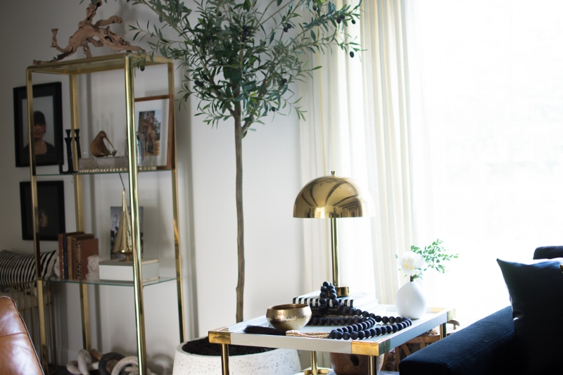
There are few other touches of Christmas sprinkled throughout the living room.  The opposite brass shelf has a little gold tree and the side table has some more fresh eucalyptus.  

DSC_1009.jpg
DSC_1024.jpg
DSC_1095.jpg

Well, that is it for now!  Stay tuned for Part II of my Holiday Tour next week when I will be hosting #5stylesofchristmas.

One Room Challenge-Week 5

1475460688709.png

Happy Thursday !  Can you believe we are almost at the end of this round of the One Room Challenge?!  We are two weeks away from the big reveal day and I am thrilled to be so close to the end.  As always, thank you to our host Linda from Calling It Home and media partner, House Beautiful, for hosting this challenge.  As a first time participant, I found joining this challenge has been extremely motivating in finishing a room.  For us, this room has been a place to store random things in between projects.  To see it so close to the end, is an extremely satisfying feeling and I cannot wait to show the completed project.  

Last week, I completely forgot to mention that the ORC has been EXTENDED!!!  Sadly, so many people were impacted by the hurricanes that hit the southern part of the country that there have been a lot of delays with their projects.  While we were blessed to not have any storm activity up here in Indiana, I welcome this extra week.

At this point, I really cannot share pictures of the actual room without giving away too much.  Last week I shares some of the art and ceiling light purchases that were made.

The ceiling light has been installed (although we are having some technical issues!).  The doors between the living room and office have been painted in the same as the wall color, Cloud Cover by Benjamin Moore.

About a year ago, I shared a before and after of some louvre doors in my living room.  I DIY'd oversized lucite and brass handles and received many requests on a tutorial.  I will be posting a tutorial soon after the ORC is complete but as a sneak peek, I thought I would show you the basics of what you need.  

I am using 18'' long and 1" diameter lucite rods.  These will be installed tomorrow and will take a whopping five minutes.  


IMG_4852.jpeg

Another DIY that has been a labor of love is my soon to be new lamp.  If you recall from my mood board, I referenced this lamp by Arteriors Home.  I am OBSESSED with it but unfortunately it's a few bucks (or more) over my budget.  Using a scrap piece of wood, I attempted to go for it with nothing but time to lose!


IMG_4788.GIF

After drawing the shape of the snake on a scrap piece of wood, we used a jig saw to cut it out.  It took patience due to the all the curves of the snake.  I made a simple three tiered pyramid, like the picture, as the base.  Then.....I sanded.  I sanded....I sanded.....I sanded......took some breaks.....and sanded.  I probably sanded this snake as much as I sanded our stairs before refinishing them.

IMG_4790.jpeg

After I sanded until I could not sand anymore, I patched the seams and cleaned them up.  The original lamp from Arteriors is made out of cast iron.  To achieve a similar appearance, I sprayed it with several light coats of Rustoleum Stone Finishes to give it a textured look.  I used it in a dark brown color but this was not going to be the final color so I suppose it really did not matter.  Once this was dry, I added several light coats of Rustoleum Oil Rubbed Bronze spray paint.  Between the texture of the stone paint and the metallic warm tone of the bronze, I am very pleased with the iron look it created.

IMG_4812-1.jpeg

At this point, it is just a sculpture, but a lamp kit is in the mail and hopefully I won't mess that up too bad.  ;)

We are down to two weeks before the big reveal and I am not going to lie, I am stressing over getting this room done!  I will be out of town for good chunk of next week so that will put me behind, but I am hoping to go into super sonic production mode this weekend!

The fabric for the chairs arrived today and I am having new cushion covers sewn but will be tackling the body of the chairs myself **gasp**

Other than the chairs, what's left is the details and it is the details that will elevate the design of a room.   

That's all for this week.  Hopefully I accomplish a lot this weekend and do not miss the deadline of my very first challenge!

xo

Saher


One Room Challenge-Week Four

1475460688709.png


She shops....and she shops...and she shops some more.  Shopping is the theme of this week's post.  

If you are visiting from Calling It Home, Welcome!  We are over half-way through the Fall 2017 One Room Challenge.  EEEK!  If you are new to my site, I am currently working on transforming my home office into a functional but stylish space.  

After a false start, I quickly changed course and started from scratch.  I created the below mood board for the re-design and am much happier with the overall look.  

As I start to design parts of the house that are more detached from the main living space, I will not be as concerned with being so strict with the flow.  Rooms should always flow, but given that our living, dining and office are technically all back to back, I really wanted the office design to be an extension of our main living room.


officemoodboard2.jpg

If you saw my story on Instagram last weekend, we unexpectedly lost one of our pet finches (Penny) on Friday night.  I was pretty much useless all weekend although I did have a spurt of energy late on Sunday afternoon and whipped out a rolling tray table/cart (Sometimes I really impress myself :) )

Candidly, I didn't do much for my office and the One Room Challenge.  Wait, does shopping count? OK! Then I accomplished A LOT!

Seriously, what did we do before online shopping?

Ready to see my virtual shopping haul?


Modway View 3-Light Ceiling Light

I loved the matte black finish and the Mid Century design of this piece.  

101128947695689p.jpg

ART

                     The Tiny Finch

                     The Tiny Finch

                                                 Saatchi Art

                                                 Saatchi Art

                                   etsy

                                   etsy

                             etsy

                             etsy

Sadly the shopping did not end there!  Also purchased was another piece of downloadable/printable art, lamps, hardware for the doors(DIY to follow) and fabric swatches for the chairs.  

I will also have a couple of DIYs to share with you that I am currently working on for the space.  Hopefully next week I can make some more progress!

Be sure to head over to Calling It Home to check on the progress of  my fellow guest participants.  Thank you to Linda and Media Host, House Beautiful, for sponsoring this event.


One Room Challenge-Week Three

Ladies and Gentlemen, we are halfway there!  Welcome to week three of the One Room Challenge.  Thank you to our gracious host Linda of Calling It Home and Media Partner House Beautiful for hosting this inspiring event.

I cannot believe we are just a few short weeks to the big reveal.  And although I am working on a smaller space, participating in the ORC has given me the motivation to finally finish this room.  I am so excited to finish up and to be able to checkmark another space of our very long reno "to do" list.  

If you follow me on Instagram (if you don't, you should ;) @househaushome) you saw the design dilemma I was facing last week.  Something with the design just felt off.  At that time, I could not explain it, but it just never felt right.  Maybe this is the reason that it's still not done after all this time.

Original Design:  

officemoodboard.jpg


While I have a love for all different design styles, I am a neutral girl to the core.  To me, white walls serve as the perfect blank canvas to layout a design that will easily be able to be refreshed and evolve as time goes on.  I love to mix the warmth of wood with metals, bold dark colors, and a contrast of creams or ivory tones.

I purchased these beautiful blush chairs from West Elm last year.  That was a huge ordeal and I will spare you the details.  Long story short, it took a hot second for them to arrive.  Although I had these amazing luxe chairs, it never felt right.  I could not decide on the walls...the rug...desk....nothing.

I was up late one night last week and couldn't stop thinking about the room.  Then it hit me.  I don't like the blush chairs in my office!  As a result, my ORC is being refreshed and this feels so right.  

Since the living room is right off the living room, I wanted the design of the living room to flow into the office.  


New Design:

officemoodboard2.jpg

Moody.  Dark.  This is my kind of space.  

My little painting disaster is almost corrected.  The walls and ceiling have been painted in Cloud Cover by Benjamin Moore.  The doors and some trim work still need to be completed.  Once again, the battle of dark vs. light on the doors is occurring.  

DSC_0659.jpg
DSC_0656.jpg
DSC_0648.jpg


I will be bringing in warmth with a MCM credenza as a nod to the original style of our home.  This particular piece has beautiful brush brass.  This metal finish makes an appearance in every room of our house.  This piece was purchased on eBay but it happens to be at a local antique store, Flux Antiques.  If you are in the Indianapolis area, be sure to check them out.  They sell via eBay, have a booth at Midland Antiques, and their store/warehouse in Fountain Square .  


DSC_0655.jpg
DSC_0660.jpg

Curtain rods, hardware and drapery have been hung but need to be hemmed and steamed.  I picked these up at my go-to store for curtains-Home Goods!  I believe they were $29.99 a pair and I needed three sets.  Not bad for 96" panels.  The color is a beautiful light taupe with a light sheen and embossed design.  I love the depth that these subtleties add to the overall look of the room.  

DSC_0650.jpg

Both the curtain rod and the rings are from Crate and Barrel.  If you sign up for emails you can get  15% coupon.  Even at full price, I found the cost very reasonable for the quality.

Let's talk about those new windows.  Sexy AF if you ask me!  My husband painted the window trim black (the outside is black as well but came pre-finished).  


DSC_0649.jpg

The last decision for today is the battle of the rugs.  Unfortunately I could not photograph the room for this post until this evening so the lighting is off due to the overhead light that is on.  

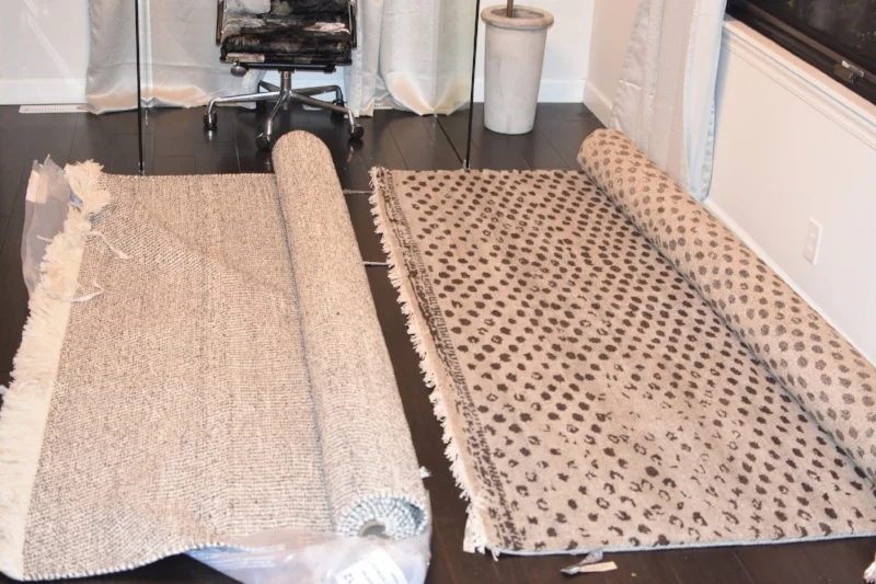
Both are so beautiful and I wish I could just smash them together and put the thick lush trim on the rug on the right.  What do you think?  

DSC_0663.jpg

Here are some close ups:

DSC_0665.jpg
DSC_0667.jpg

The second rug is more of a dark greige with dark brownie black spots. 

I am leaning one way but do not want to let the other one go.  #firstworldproblems

So there you have it.  Week three is DONE.  

Week Four will consist of:

  • Finishing paint
  • Hemming and pressing curtains
  • Finalizing rug choice
  • Sourcing Art
  • Styling Etagere
  • Some other surprises that I hope to start

Be sure to check out my fellow Guest Participants over at Calling It Home to see their progress.

Please swing by next week to check on the progress.

One Room Challenge-Week Two


1475460688709.png

Happy Thursday Guys!

I can't believe we are already at the second week of the ORC!  As a newbie, I am really happy I chose to tackle a smaller room.  Balancing work and life, learning to navigate a blog, taking pictures...PHEW...I have a new sense of admiration for those who have been doing all of this all this time! It is way harder than it looks. 

If you recall from Week One, we had three walls of 1950s orange bookcases.  As they were brought down, we slowly introduced much needed natural light into this room.  Our backyard has several large trees which causes a problem for our north facing rooms.  

office2.jpg
office3.jpg
office4.jpg

As I mentioned in last week's post, there were a few surprises during the demo.  The first surprise (which we figured out prior to the demo) is that there was a closet behind one of the built ins.  There is another door to this closet that can be accessed in our hallway so we decided to close up this entrance to have more, very much needed wall space.

Surprise number two:

Oh heyyyyyyyyy there, window.  We had NO IDEA that you were hiding behind that orange bookcase!  Now this was a VERY pleasant surprise!

(Quick shoutout! All of the major construction in our home is being done by Distinctive Home Solutions.  If you are in the Indianapolis area, I highly recommend them.  Sean (one of our contractors who has also become a great friend) was kind enough to always snap me progress photos since I am at work when the magic happens.)

IMG_3020.JPG

Since the walls came down, there has been a good amount of progress made, but also one regret.   I will touch on that in a bit. 

The espresso floors were installed and our ceiling light was added.  I choose the Vega Brushed Brass Flush mount light from CB2.  I was in love with the frosted round domes, brass finish, and the price point was perfect for our budget.  

The brass etagere was my very first purchase from an antique store back in 2012.  At that time, our house was almost all IKEA (rolling eyes).  If you are a fellow Hoosier, you must check out Midland Antiques located in downtown Indianapolis.  It is an old warehouse filled with all sorts of goodies.  I went there specifically looking for this piece.  After an hour of walking around and exploring, I started to leave when I saw something glisten.  Underneath about 400 vases, books, and other items, stood my beautiful baby.  I slowly walked over with the expectation that this would be at least $1000, BUT I WAS WRONG.  I remember the exact amount I spent, $243.00.  I was ec-sta-tic!  

office7.jpg

All the windows in our home will be replaced as we renovate each space.  These are the original windows from 1954 and they are in rough shape.  You can see dried out caulk along the edges and I am pretty sure if I sneezed, it would fall out. 

We have been working with Pella Windows and have chosen an unfinished interior/black exterior and will be painting the interior part (black) ourselves.  I do not recall the exact savings but it was several hundred per window.  Luckily I have my very own painter....my husband, Chris, who handles all of our painting needs.

Now, back to the regret.  Paint.  There is not a home DIY task that I despise more than painting.  Nothing.  I was really excited to come home and find that my husband had finished painting the walls and the ceiling.  24 hours later I realized I hated it.  It was too dark.  It felt cold.  There was no warm undertone to the paint.  

I politely requested he repaint the room in the same off white color we had in our living room.  Well folks, he pretty much laughed in my face and told me it would "grow on me".  I guess I have another item to add to my "to do" list!

Most of the items that will be in this space are already owned, but I have been on the hunt for a rug for a long time.  I swung into my local West Elm since they had their 20% off sale this weekend and came across this rug on display when I walked in:

IMG_4495-1.jpeg

I found this blush pillow in the store and threw it down to see how it looked with the rug.  My chairs are this same blush color and I have been going back and forth and back and forth and back and forth with rugs.  Do I go dark? Do I go light? From far away, this appeared to be a solid, but close up this was a tweed style mix of various colors with the plushest ivory fringe on the end.  I LOVE me some tassels or fringe on rugs.  

I took a few laps around the store, kept coming back to stare at the pillow/rug combo and finally inquired about the rug and price. 

Wait for it....an 8 x 10 was $319 + 20% off for a total of $255 ! SOLD!  

The downside is that I have to wait for it to be shipped to the store.  I just need to be patient for a couple of weeks and then it will be here for the install.  I have plenty to do till then!

Next week I should have some big updates to share:

  • New paint color
  • Windows
  • Furniture (if you saw my Insta-Story today, you got a sneak peak)
  • Curtain rods and maybe even curtains.  Maybe....

Thanks so much for visiting!  Be sure to checkout the other participants over at Calling It Home!

xoxo

Saher


DIY-Upolstered Box

I know what you are thinking.  Yes, I am blogging about a box.  This is the easiest, but most useful, DIY I have ever done.  

About 5 years ago, I was viewing a room tour on a blog.  The coffee table had this beautiful snakeskin box which housed all of their ugly remote controls.  I do not recall where the box was from, but I do remember it had a lot of zeros in the price tag.  Paying that much for a box was not in my budget.  (Similar dreamy box below)


                          via One Kings Lane

                          via One Kings Lane

I spent countless hours searching online for a look-a-like but was unsuccessful in my hunt. 

I decided I would make my own.  I went to my local fabric store and found a remnant of a faux snakeskin for a few dollars.  I picked up a few other items and in a short period of time, I had a budget friendly solution for our coffee table and many years later, it's still in use, holding and hiding all of our remotes, matches, and other knick knacks!

IMG_4502.JPG
IMG_4502.JPG

Just think about it, you could make ANY style box you wanted. Malachite? Done. Floral? No problem! Leopard print? You got it!  With just a few item and less than an hour, you can make a box of your own.

THINGS YOU WILL NEED:

  • Box.  Pick your size.  I used this one from Amazon.  This was the perfect size to hold remotes and other items. It also has hinges which I like.
  • Hot glue gun/glue or glue of you choice
  • Scissors
  • Fabric of your choice.  Size dependent of the size of box.  I am using a remnant of Designer's Guild-Orangerie. 
  • Felt (optional)
DSC_0630.JPG

STEP ONE:

  • Pick your fabric and cut to size ensuring you have enough fabric to fold over the sides (if your fabric has creases or wrinkles, I would recommend ironing these out before gluing for a cleaner finish.)
  • Glue fabric to base and top and then the sides.


DSC_0632.JPG

STEP TWO:

  • Fold corners as pictured and cut off excess.  I find this gives the corners a cleaner look with less fabric bulking.  
DSC_0634.JPG
DSC_0636.JPG

STEP THREE

  • Glue edges, sides,and clean up all the details with glue.  This will vary for each person and his/her technique for gluing.  


DSC_0639.JPG

Complete all gluing to both the top and bottom of your box.


DSC_0641.JPG

STEP FOUR:

Optional: Line the inside of the box with felt  

As before, glue sections at a time and line the raw sides with felt.  


DSC_0642.JPG
DSC_0645.JPG

Let's quickly add up the total cost:

  • Fabric-remnant I had on hand
  • Felt $0.50 (On sale at Joann's 4/$1.00)
  • Glue-already owned it
  • Scissors-already had these!
  • Box-$14.54

TOTAL: $15.04

That's it guys!  The box is super versatile and can be used to hide your remotes, as a jewelry box, or purely decoratively.  It does take some time for the box to close properly (all that fabric makes it have a itsy bitsy gap).  I would put a book or two on top for a day or so to help it close better.

Since this is my first DIY, I wanted to celebrate by hosting a **GIVEAWAY** of the Orangerie Box pictured above.  Double click the picture on IG + Tag a friend who loves DIY and design and the winner will be chosen at random (shipping included!) 


Happy DIYing! 


xoxo

Saher 

One Room Challenge-Week One


Hi hello! I am thrilled (and crazy nervous) to be jumping on board for my first ever One Room Challenge™.  For years I have read hundreds of ORC posts, watched their transformations....would daydream about participating...being a feature designer...fantasizing about the room I would transform.....but then I would go put on Netflix or Harry Potter and sit on the couch. Whaaaa whaaaa.    

Thanks so much to Linda of Calling it Home  and Media Partner House Beautiful for hosting this fab-u-lous opportunity and allowing little ole aspiring design bloggers, like yours truly, to participate.  

1475460688709.png

I am new to blogging.  This my second post everrrrrrrrr.  Go big or go home, right?! So I apologize for any mistakes as a give myself a crash course in blogging while I navigate this 6 week makeover challenge.  

Ready to see the ugliest office ever???

Welcome to 1954!

office1.jpg

Now, I know built-ins are totally in right now.  I love them, wish I had some (they don't go with my house though!).  These are not the type of built ins that the design world is gushing over.  

One of my favorite things about renovating an old home is uncovering the story of the life that lived within the four walls before us.  While I am not a fan of the excessive built in basic book shelves on every. single. wall. in this house, I love the story behind them.  

The previous owner was a Scientist.  Yes, ladies and gentlemen, a real life scientist.  He was an extremely well read man and this home was filled with walls upon walls of books.  I never saw the house in that state (info provided by the realtor) and this "before" picture of mine is actually their after with some help of a stager.  Having my husband agree to remove these has been a battle, but he has finally realized I am right (see that right there? :) ) and that they have to go.  We do not own enough books to even fill one shelf nor are we really avid readers.

The photo below shows the layout and location of the office to the living room.  The living room has already been completely updated and I will be sharing before/after pictures of that in a later post.

office8.jpg


Soooooo...here's a little secret...that's not the current state of the office, but that is where this 6 week design journey is starting.  I have learned from listening to Chris Loves Julia's podcast (if you don't listen, you totally should) that you really do not have to have your transformation in real time.  Yes!!!

The Plan

  • All bookcases removed.  
  • Floors-replaced with espresso engineered hardwood.  This will be running throughout our home w/ the exception of bathrooms and the entryway. 
  • Build out wall.  You cannot see it from this photo but that bookcase to the left is built over a sliding door *insert eye roll*  This closet has another door in the hallway so there is no need for two doors to one small closet.  Oh, 1950s builders, what were you thinking?
  • Let the room ooze with femininity.  You have heard of a man cave, right? Well, this is my woman cave.  Blush.  Florals. Brass. Maybe some unicorns and rainbows.  
  • Functional.  I occasionally work from home and am committed to blogging so I need space to work, store my arts and crafts, and so on.  

Mood Board

I am still determining whether I want the rug to be dark/light, sorting out all the details such as art and accessories, but I have laid out the high level design of the room.  

As I mentioned on my welcome page, I do try and mix high/low/DIY as much as possible and this mood board is a perfect example.  I will dive into more details as the weeks progress on sources and costs.  Full disclaimer, I am going to be an open book about cost.  I feel it is extremely important to those wanting to tackle a renovation to have some idea on pricing.  


officemoodboard.jpg


I am so excited to finally be tackling this project and creating a private space where I can work. Stay tuned to next week when the bookcases come down and the surprises behind them are revealed.

Thanks so much for following along!

xo

Saher